Previously, we have already presented the bedroom and bathroom of Mateusz Czeczko's design. Now we take a look at the open living area.
View of the bedroom
© Czeczko Design
A new beginning
The investors, a couple of seniors, previously had lived in a much larger space. How did they manage to fit everything the couple was used to having into just 32 meters?
- It was quite a challenge. However, the investors were very open to our ideas. And we managed to plan the space very rationally - so that everything that was most important could easily fit in," says Mateusz Czeczko.
The investors wanted to make a few small changes, including creating a comfortable kitchen and setting out as many places as possible for storing life's possessions.
The interior does not lack colorful accents
© Czeczko Design
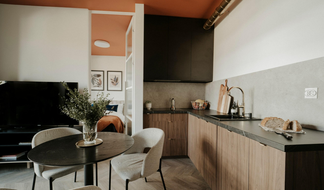
A clever kitchenette
The kitchenette was arranged in the place originally intended by the developer for a kitchen, but not all household appliances managed to fit in it. In order to maximize the ergonomics of this space and at the same time not overwhelm it with excess build-out, the refrigerator and oven were moved to the corridor and placed in a high built-in cabinet. In addition to kitchen appliances and a mini pantry, there was room for a capacious closet for clothes and shoes. The built-in in the corridor is crowned by an illuminated display case, where the owners store tableware and souvenirs.
The illuminated display case and built-ins with household appliances
© Czeczko Design
In the kitchen it was possible to install quite large worktops. Only the lower part of the annex is built-in. It was equipped with convenient and capacious cargo shelves and even a dishwasher. Apart from a single cabinet with a matte black front and a hood hidden behind a narrow wall, there are no hanging cabinets. The longer wall above the countertop is free. The top is routed with a catering pipe, which was not only not masked in any way, but was painted gold, giving it a decorative character and referring to accessories of the same color.
-I tried to design the space in such a way as to relieve the living room area as much as possible. That's why we did away with the hanging kitchen area. The wall above the countertop can be seen from the living room. Thanks to the fact that it is empty, it gives the feeling of more space. In the living room, there are also no tall bookcases or a unified development around the TV, all of which would clutter the space," describes the architect.
Gold elements in the kitchen
© Czeczko Design
Living room weave of new with old
Most of the furniture in the apartment is new - either bought or custom-made to the architect's design. However, there are heirlooms and decorations among them, which the owners brought from their previous apartment. The host's coffee table was brought from the US 20 years ago. Made of old oak, it was previously... a clock face. For a long time it lay in the basement. After adding legs, it became a comfortable and original table. There was also a place for a floor lamp, which was a gift on the occasion of a wedding anniversary - after replacing the lampshade, it fit perfectly into the new premises. Most of the small mementos that the owners decided to move from their previous apartment were placed in a display case in the hallway - there was a set of teacups from the 1970s and figurines from a cake served on the occasion of the 45th wedding anniversary, among others.
TV corner
© Czeczko Design
The element that connects the various zones of the apartment is the floor, for which panels arranged in a French herringbone pattern were chosen. Thanks to its water-resistant properties, it is easy to keep clean and is also successful in the kitchen and hallway. Cohesion is also given to the interior by a subdued color palette - beiges, grays, browns and decorative elements in the shade of precious gold predominate here.
The table was created from a clock face
© Czeczko Design
Are you decorating your apartment? We have more inspiration for you! ClickHERE


