How to use colors so that the arrangement is neither boring nor overwhelming? We check on the example of two realizations of the Szydlik Wnętrza studio.
Fashionable colors
Interior design often draws inspiration from the world of fashion. Observing the latest collections of finishes and furnishings, we can easily notice these influences.
- We observe several, let's call it, popular trends at the moment. Subdued earth colors, soft pastels, expressive eclecticism combining opposite, often very intense hues. If we isolate specific colors, the most common are all variants of green, brown, pink and blue," says Rita Jankowska of Szydlik Wnętrza studio.
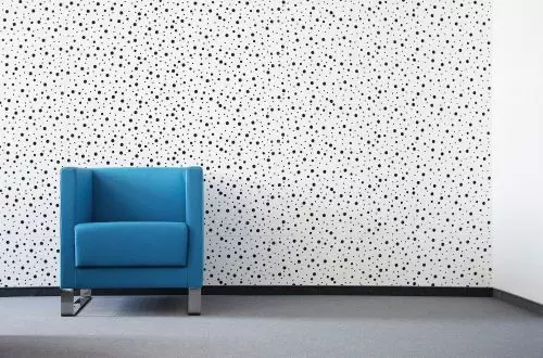
Shades of blue are currently very fashionable
Photo Vertical Level © AQ Form
Colors that put us in a good mood
The colors we surround ourselves with have a huge impact on how we will feel in our home. Colors can affect us in a variety of ways. Some have a calming effect, while others stimulate action. So it's important to choose them consciously, adjusting them to the function of the room and the desired effect.
- It is assumed that cool shades calm us, while warm ones stimulate us. Subdued colors allow us to concentrate better, while an environment of saturated, bright colors encourages us to be active and stimulates creativity. Little, a particular color, depending on whether it is muted, pastel or bright, will affect us differently, the designer adds.
Colors affect how we will feel in an apartment
Photo Vertical Level © AQ Form
Colors vs. square footage
The size of the room is also crucial when choosing a color scheme for our interior.
- As a rule, in small spaces it is worth using light shades that do not take away the light, and thus avoid the impression of being overwhelmed. Darker or more saturated colors in small spaces also work, but it requires a lot of skill to compose and arrange them well in the space, says Krzysztof Szydlik.
Use bright colors in small spaces
Photo Vertical Level © AQ Form
Copperfield
- And when it comes to the choice of color, for example, for an apartment where the owner is a man, it should come as no surprise that dark colors, such as brown, navy blue, black, tend to prevail. This is largely due to the influence of pop culture, especially movies. In comparison, royal chambers were colorful, richly decorated, with lots of patterns. On the other hand, when we see the interior of Bruce Wayne's apartment or Vito Corleone's study, here we rather find similarities with today's masculine interiors. However, much depends on the user. In the case of our Copperfield realization, which is precisely an apartment designed for a man, we will find copper, whitewashed wood, and shades of pink. After all, they say that real men are not afraid of pink! - adds the designer.
In the interior for a man you can also cleverly use shades of pink
Photo Vertical Level © AQ Form
Le Monde
Experimenting with colors, we can create really interesting arrangements that allow us to express ourselves and accentuate our taste. However, it is important to balance between subdued shades and expressive accents. This will help us create a harmonious and aesthetically pleasing space.
- Our Le Monde implementation is a great example of this. In addition to the client's preferences, the balance between colors is important. Their saturation, temperature and quantity. There is no specific advice or method for this. Each project is like a recipe for a new dish - to make it tasty, the ingredients must be well balanced," adds Rita Jankowska.
It is important to maintain a balance between colorful accents and a subdued base
Photo Vertical Level © AQ Form
Colorful kitchen
When choosing colors for our apartment, we must pay special attention to lighting. After all, different types of light affect how a particular shade will look. So how to choose the right lamps for a colorful kitchen, for example?
- It is important that the light performs its two main functions - utilitarian, such as illuminating the kitchen worktop, and decorative, with which we create a mood in the interior. The whole thing comes out even better if we take care of lighting of good quality and appropriate parameters, such as the number of lumens, light color, color rendering index (CRI), explains Krzysztof Szydlik.
In a colorful kitchen, it is very important to choose the right lighting
Photo: Pion Level © AQ Form
Lighting selected according to its purpose
When choosing a luminaire, we must keep in mind what function it is to serve. A different lamp will work for illuminating the entire room, and another for highlighting a specific point.
- In the case of the two projects presented here, we mostly used lighting with a color of 3000K and the highest possible CRI coefficient. As a result, the colors are not distorted by the lighting, and thus the interiors look striking. In the interior of Le Monde, more precisely in the kitchen we see a linear fixture, and already in the bedroom - on both sides of the bed hang extremely decorative fixtures of two different sizes! - adds the architect.
Next to the bed, the architects used decorative fixtures
Photo Vertical Level © AQ Form
Are you decorating your apartment? We have more inspiration for you!
Design:KATARZYNA SZOSTAK
