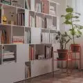
We have previously presented the living area of a 300-square-meter house near Paris. Today we visit the private area and the guest house designed by Malwina Morelewska.
Feel at home
The investors wanted a visiting family from Poland to feel at ease. Therefore, a guest house was created by the pool. Under a large canopy, there was already an outdoor kitchen and dining area. The architect added a relaxation space, consisting of a large soft sofa, a footstool and a functional coffee table.
Under the canopy, there is a kitchen, dining area and lounge space
Styling: Malwina Morelewska Photo: Yassen Hristov
Austere but cozy
An additional seating area was arranged right at the exit to the terrace. The owners wanted the interiors to have a more austere character than the decor of the main building. At the same time, it was intended to relate to the simple form of the house. The architect created a fluted wall with shelves, against which stood a sofa and a table. Designer hid the guest bathroom behind the built-in. Its arrangement is also minimalist. Along the entire length of the raw concrete wall, an alcove was created to form a practical shelf. At the other end of the bathroom, there is a shower area finished with panels imitating patinated metal.
The interior of the guest house has a raw character
Styling: Malwina Morelewska Photo: Yassen Hristov
Stylish details
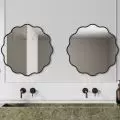
A guest area was also designed in the main building. On the first floor there is a small toilet. The owner dreamed of a natural stone on one of the walls. She finally chose blue quartzite with decorative fluting. Its intense color is enhanced by the pure white of the large-format tiles. A design highlight is a mirror by Oskar Zięta. Thanks to this, the tiny space has gained a stylish character.
The wall of the guest toilet is covered with blue quartzite
Styling: Malwina Morelewska Photo: Yassen Hristov
Next to it, there is a small guest bedroom connected to the bathroom. The central wall with a wide bed is decorated with a wallpaper with a botanical pattern. The floral motif goes into the adjacent bathroom, creating a stylistic whole.
Unique staircase
An intriguing staircase leads to the private area. They were made of bent metal anchored in the upper flight to the wall. This solution gives an interesting visual effect. The stairs look like a crimson ribbon floating in the air, draped from a thin sheet. They are finished with a metal railing welded to the steps. It also lifts the glass. Despite the heavy load, the whole looks light.
A unique staircase leads to the private area
Styling: Malwina Morelewska Photo: Yassen Hristov
The investor wanted the space under the stairs to be used for storage. Malwina Morelewska built up this area with capacious cabinets. This made it possible to use every inch under the slant. The wall near the stairs is decorated with the same sinters that can be found in the kitchen. Against their background, lamps with a subtle, graphic design stand out.
Combination of modernity and classics
The owners wished for a colorful tranquility in their bedroom. However, at the same time they wanted to avoid boredom. So the architect suggested a base consisting of neutral gray and fresh white.
- The colors were very important to the investor. She wanted them to intertwine and was not afraid to use them. She is a decisive person. If she likes something, she accepts it without thinking, and if she doesn't, she signals it clearly right away. This was the case with a stylish dressing table she brought from Poland, or a rocking horse scouted out at a French brocante. I knew that the investor likes objects with a soul, and I didn't try to convince her that they might not fit into the modern decor. On the contrary, I was happy that the historic piece of furniture, with a beautiful double-winged mirror, would enrich the design of the bedroom — says the architect.
The decorative dressing table was juxtaposed with white simple cabinets and bookshelves. This made it possible to achieve a balanced arrangement. Against the background of the gray wall, the designer set the bed with massive legs. The floor was lined with planks of whitewashed wood. Colorful accents are introduced by textiles and accessories in energetic shades, which relate to the floral upholstery of the armchairs.
The bedroom features a vintage dressing table
Styling: Malwina Morelewska Photo: Yassen Hristov
Feminine accents
Just next to the bedroom, a sizable dressing room and a private bathroom have been arranged. Here you will also find concrete gray. This time in the form of micro-cement. Against its background, pink ceramics and drawer fronts under the countertop stand out beautifully. Meanwhile, the wall behind the free-standing bathtub is decorated with floral wallpaper. It is worth noting the radiators with indentations for towels. Behind them, the architect hid a shower and a toilet, which was cleverly separated from the bath area.
The gray bathroom was varied with pink accents
Styling: Malwina Morelewska Photo: Yassen Hristov
Prepared for growth
Malwina Morelewska designed the children's rooms so that they could „grow” with the youngest residents. In the daughter's room the base is white. It is formed by built-in furniture with capacious cabinets. The wall opposite the entrance was covered with wallpaper in botanical-graphic patterns. On its background stands a crib and a chest of drawers. When the girl grows up and wants to change the design of her room, the teenager's furniture will compose just as well.
The rooms are designed so that they can easily be modified when the children are older
Styling: Malwina Morelewska Photo: Yassen Hristov
The walls in the son's room were decorated with a mix of muted green, white and honey-toned wood. The whole room is varied by a motif of exotic animals. Between the rooms there is a shared bathroom. Here the designer decided to use gray tiles imitating terrazzo. Against their background stand out accessories in the color of pink and black.
Are you decorating your apartment? We have more inspiration for you!
Compiled by:KATARZYNA SZOSTAK


