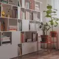
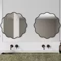
Although in her work, Maja Smichura of Deer Design Interior Architecture Studio boldly blends distant styles, under her own roof she has opted for a nuanced form of minimalism.
The apartment is 56 square meters
Photo: Zagórny Studio
The challenge of designing for oneself
The apartment is located in a new Warsaw development. The designer decided to buy it, among other things, because of the bay window in the living room, which she plans to turn into a mini-living room. She also liked the rational use of space. The 56 meters include a hallway, living room with a kitchenette, two bedrooms, a bathroom and a toilet.
As befits an interior designer, Maja made minor changes.
- I made the hallway smaller to reduce the meters lost to communication. As a result, I made room for a large closet with mirrored fronts, which optically enlarges the hallway, and also gained additional meters in adjacent rooms. In addition, I turned the planned toilet into a dressing room, no longer accessible from the hallway, but from the bedroom. There, behind a glass door, I also found a place for a washing machine, thanks to which the bathroom could become a real space for relaxation," the designer reports.
Maja Smichura
Photo: private archive
Soothing colors
- The apartment is located on the first floor, so from the beginning I was determined to illuminate it with bright colors. Hence the white walls and ceilings, shades of natural wood, delicate grays, " mentions the architect from the Deer Design studio.
The neutral base is broken by black accessories and strong color accents, such as yellow lamps in the bedroom, a blue mirror and a green RTV cabinet.
The RTV cabinet has an interesting green hue
Photo: Zagórny Studio
Memphis style influences
The arrangement is inspired by japandi combined with wabi-sabi and organic themes, but with a breakthrough in the form of Memphis-style accents. Just after crossing the threshold, it is the references to the design avant-garde of the 1980s from the circle of Ettore Sottsass that are easiest to spot.
- Among its hallmarks, in addition to bold, even crazy forms, were very intense colors. I, however, opted for calm tones of black and white, " says Maja Smichura.
The mirror frame and stuccowork on the ceiling are maintained in this aesthetic. In addition, we can admire the custom-made wooden cabinet handles and the console on turned legs made by talented craftsmen.
The console on turned legs was made by craftsmen
Photo: Zagórny Studio
Inspiring practical and aesthetic solutions
In the living area and bathroom, the floor was covered with micro-cement. This choice is dictated by the dream of having a dog. The dining room and bedrooms, on the other hand, have been insulated with wood grain planks. In the interior, we can see many soft lines. The mirror frames have a wavy shape, the RTV cabinet handles are rounded, while the edges of the tiles in the bathroom and kitchen are irregular. This adds a soothing character to the interior.
The fixtures have soft lines
Photo: Zagórny Studio
Around the table
One of the first purchases was a coffee table made of natural marble.
- You could say that I built the entire living room design around this piece of furniture," smiles the architect.
One of her favorite furnishings is also a fancy mirror - a gift from her friends at Deer Design studio.
The marble coffee table was the starting point for creating the arrangement
Photo: Zagórny Studio
The dining area was separated from the living space. However, the designer did not use divisions that would optically reduce the space. Instead, expressive black furniture was used, set against the background of a piece of arched wooden floor. The original bookcase is also worth noting.
- Given the square footage and layout of the living room, I was tempted to take an unusual approach to this piece of furniture. It stood not along the wall, but perpendicular to it. Thanks to this it closes the view from the hall, and at the same time obscures the radiator, although it does not impede the circulation of warm air," describes the architect.
The dining room was separated from the living room
Photo: Zagórny Studio
Durable finishing materials
The kitchen has the form of an annex. Out of concern for usability issues, instead of a natural finish, the architect chose a laminate that deceptively imitates a knotless veneer. Instead, the naturally resistant material is quartzite used on the countertop. The stone was not polished, but flamed. As a result, it has a delicate texture.
The countertop was made of quartzite subjected to flaming
Photo: Zagórny Studio
- I spent a long time looking for the perfect pattern, as long as five months. However, I believe that the result was worth the effort," she points out.
The space above the countertop was finished with zellige-type ceramic tiles. The glossy glaze of the Moroccan-inspired tiles beautifully reflects the light. Maja Śmichura decided to dispense with wall cabinets. Instead, only a decorative shelf appeared. Instead, the storage space is housed in a tall built-in cabinet next to it.
The space above the countertop was covered with zellige tiles.
Photo: Zagórny Studio
Everything in its place
In the master bedroom, shifting walls made it possible to change the position of the bed. The piece of furniture itself doesn't take up much space, but it has roomy storage, and its headrest mimics two large cushions. There is also room for a capacious closet.
- If in the future this enclosure proves insufficient, there is room next to it for its continuation," points out the architect from Deer Design.
The headrest of the bed resembles large pillows
Photo: Zagórny Studio
Currently, this space is reserved for a huge mirror, which is not only useful for everyday styling, but also optically enlarges the small room. An openwork bookcase with an original form adds to the whole charm.
Above the bed there is a bookcase for small items
Photo: Zagórny Studio
Coherent arrangement of the bathroom
The relaxing atmosphere of the bathroom was created by using shades of natural wood in the form of the development and the pattern of light stone on the tiles.
- Everyone who has been here calls it a home spa," says the designer proudly.
The same stoneware was used to create the countertop. This is because the architect did not want to introduce another material. It is worth noting the motif of arches crowning the fronts of the furniture. Decorative trinkets found their place on the shelf above the bathtub located in the recess between the corner of the bathroom and the plumbing closet. This is one of Mai's favorite solutions. Another is the fixtures in a shade of brushed graphite.
Shades of natural wood give the bathroom a cozy character
Photo: Zagórny Studio
Are you decorating your apartment? We have more inspiration for you!
Compiled by:KATARZYNA SZOSTAK


