


Tomasz Polanski has designed an apartment in Zielonki near Krakow. The arrangement is inspired by Parisian interiors.
A project for professionals
The apartment is as large as 124 sqm. It consists of a living room with a kitchenette, a bedroom, two bathrooms and children's rooms, as well as a study and a dressing room. The investors work in the construction industry. So they had clear expectations. Their dream was a Parisian interior, which would include a functional kitchen.
- Although I'm not sure that I was able to completely realize the clients' dream of Parisian style, their positive reaction to the project is extremely gratifying. Interior design trends are something we juggle on a daily basis, creating different variations, so we are able to create out-of-the-box designs. I don't like to reproduce - this is the opposite of creativity, and yet this is what should be required of architects," says Tomasz Polanski.

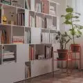
The individual zones in the living area were separated by colors
Photo by Patryk Polewany
A wealth of contrasts
The open living area was divided into a lounge, dining and kitchen area. The optical separation of these zones was clearly emphasized through the use of decorative wallpaper on the ceiling and a delicately patterned black and white carpet on the floor. Distinctive finishes filled the interior, consisting of white walls and dark furnishings. A rectangular motif runs throughout the apartment. We can notice it in the shape of the furniture, the frames and milled kitchen fronts, and the stucco walls.

The ceiling in the dining area was decorated with patterned wallpaper
Photo by Patryk Polewany
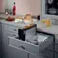
Modern solutions in a non-standard space
Arranging the kitchen was a challenge. This was due to the highly irregular shapes left over from the previous layout of the building. Tomasz Polanski therefore used many functional solutions dressed in designer forms. One such example is the illuminated bookcase located behind the countertop. The furniture was hidden behind sliding fronts with a mirror finish. To keep the arrangement consistent, not a single wall cabinet appears in the design. So where is the hood located? The architect opted for a model integrated with the induction hob. Thanks to this, it was possible to maintain the simplicity of the development. On the other hand, the individual functional zones were delineated by means of colors. They, too, are a consistent continuation of the colors used throughout the apartment. So the dominant colors are white and black.


The kitchen cabinetry has a simple form
Photo by Patryk Polewany
Subtle and sturdy
The dining room is complemented by a large metal bookcase. It is worth looking at how it was made. The furniture was attached to a pre-prepared steel substructure mounted in the false ceiling. Thanks to this, the very thin bars can withstand heavy loads such as marble decorations. Such a solution makes a subtle and delicate piece of furniture also functional. In addition, investors have plenty of space to store and display trinkets. At the same time, however, the space is not overwhelmed.


The metal bookcase was attached to a special structure
Photo by Patryk Polewany
Keeping the balance
The element found in the bedroom was a large century-old closet, located at the entrance. The architect's task was to create an arrangement that would take advantage of this piece of furniture and be consistent with its unique appearance. So Polansky opted for calmer textures that carried the viewer's gaze to the rest of the more subdued furnishings. This also created an intriguing contrast.

The bedroom decor is subdued
Photo by Patrick Polewany
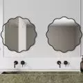
Creative approach to a small bathroom
Arranging the bathroom on the first floor involved some difficulties. The room has bevels. In addition, it is narrow and oblong. However, the architect decided to use these disadvantages and turn them into advantages. The designer divided the space into 2 zones - sea and dry. The different parts were separated by a glass door, behind which the shower is located. As a result, the bathroom has everything the clients dreamed of: a free-standing bathtub and a separate shower, as well as a dry zone with two independent sinks, a toilet and a built-in cabinet where washing machines are hidden. The problem of small space, on the other hand, was solved with aged mirrors. Two walls were lined with them, which optically enlarges the interior.

The arrangement of the bathroom was hampered by the bevels
Photo by Patryk Polewany


The bathroom was divided into two zones
Photo: Patryk Polewany
Are you decorating your apartment? We have more inspiration for you!
Compiled by:KATARZYNA SZOSTAK