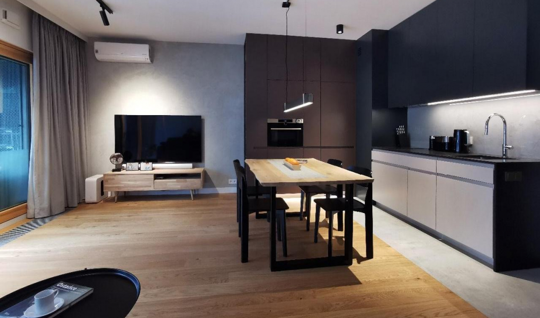
The goal of the Sojka&Wojciechowski studio was to create an open, spacious and light space. They opted primarily for the contrast of black and white, which blends perfectly with the large glazing that illuminates the interior.
Black, white and shades of gray define this interior
Photo by Konrad Sojka, © Sojka&Wojciechowski
The apartment of forty-five square meters was to become, above all, a visually expressive space. At the same time, it was necessary to ensure the functionality of the apartment. It was intended for two young people.
The challenge was the small size of the rooms, especially the bedroom and bathroom, and their height - 2.7 meters. In addition, the windows here are wide, but they end relatively low, at a height of 2.2 meters, which unfortunately does not add space to the apartment," says Konrad Sojka, an architect from the Sojka&Wojciechowski studio
A color imitating concrete was decided on the walls
photo: Konrad Sojka, © Sojka&Wojciechowski
white, black and light wood
In the interiors it was important to use white and black as contrasting elements. Furniture and accessories were dominated by dark color and wood. White is more strongly visible in the walls imitating the color of concrete. Wood also appears everywhere. A similar color combination, gray and white, was used in the kitchen fronts. The lower cabinets are mainly white elements, while the top is closer to gray. The space where only one dominant color appears is the bathroom - fully finished in white.
Textures have been simplified as much as possible in all surfaces
photo by Konrad Sojka, © Sojka&Wojciechowski
putting a premium on good light and shading
The living room along with the kitchenette was equipped with several points of light. The modern distribution of lamps, consisted of small fluorescent lamps, tubes on the ceiling or a loft lamp over the dining room table.
They are very convenient to use. They can be freely moved and directed, and without renovation and without large expenses, the number of them can be increased," points out Konrad Sojka.
The source of light has been dispersed in the apartment
Photo: Konrad Sojka, © Sojka&Wojciechowski
This does not mean that the apartment is badly lit. The architects decided to introduce decorative window covers. The curtains were placed on hidden curtain rods, which are not visible. This technical solution was very important.
Here we used ceiling-mounted rails, which we are very fond of using in our projects. They were covered by simple bezels 10 centimeters wide, painted to match the color of the ceiling. Due to such a restrained form and color scheme, these elements do not focus attention on themselves," says Konrad Sojka.
looking for the right form
The apartment designed by Sojka&Wojciechowski uses the black and white contrast to optically enlarge the apartment, give it the right proportions and set aside adequate space for storage.
The toilet was fully dominated by white
Photo by Konrad Sojka, © Sojka&Wojciechowski


