How to combine modernity with vintage aesthetics? You can find the answer to this question in the project of the Toruń based studio YONO Architecture.
Thorough changes
The 65-square-meter apartment was furnished for a family of three.
- We started with quite large changes in the layout of the apartment, specifically, by removing four of the six existing walls. That way we enlarged the living area (the wall between the kitchen and living room was removed), the bedroom and the child's room (at the expense of a third, very small room) - describes Sebastian Marach.
The changes were dictated solely by the functionality of the space, beacuse investors wanted it to be more open.
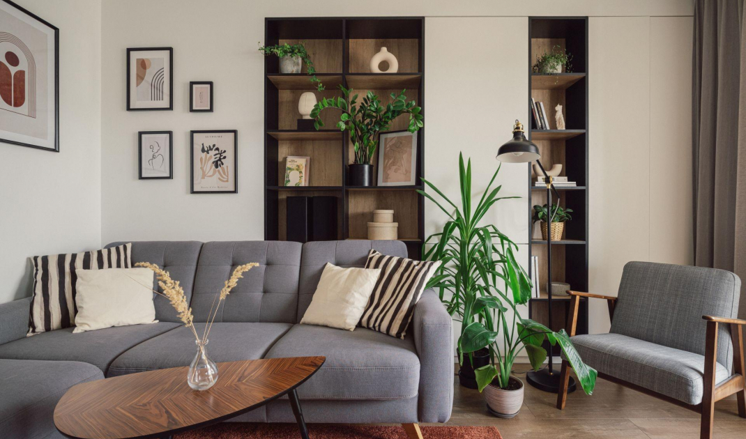
The arrangement is based on a combination of white, wood and dark accents
Photo: Kroniki Studio
Designer accessories
The main goal was to combine a modern apartment with vintage-style elements. The arrangment is based on combination of white and wood with addition of dark accents. The bright living area features a kitchenette, a sofa and a round table from one of the Polish manufactures. Next to the table you will find a real gem. These are chairs manufactured in Denmark in the 1960s. They were found by the owners in a small antique shop in a village during one of their trips.
The chairs were brought from the trip
Photo: Kroniki Studio
Multitasking solutions
The kitchenette was separated from the lounge area by a low wall. On one side it hides an additional kitchen cabinet, while on the other, it creates a place for TV. Just behind the sofa stands a bookcase. It was created as a result of the new wall layout. The furniture was placed under a reinforced concrete stringer. Natural light plays very important role here. Sun enters the interior almost all day long, since the windows face mainly south.
The wall on one side hides the kitchen built-in, on the other creates a place for the TV
Photo: Kroniki Studio
Coherently and comfortably
The bathroom continues the color scheme of the other rooms. The arrangement is complemented with an accent in the form of ornamental tiles. Passing the bathroom, we go to the bedroom, where one of the walls is entirely glazed. It overlooks the balcony. The main element of the bedroom is the bed. It is one of the favorite pieces of the owners. They fell in love with how comfortable it is and its eye-catching design. The loosely sewn cover falls freely on the solid structure of the furniture. There is also a dressing table and a stylish desk with a workspace.
Passing the bathroom, we move on to the bedroom
Photo: Kroniki Studio
Are you decorating your apartment? We have more inspiration for you!
Elaboration:KATARZYNA SZOSTAK


