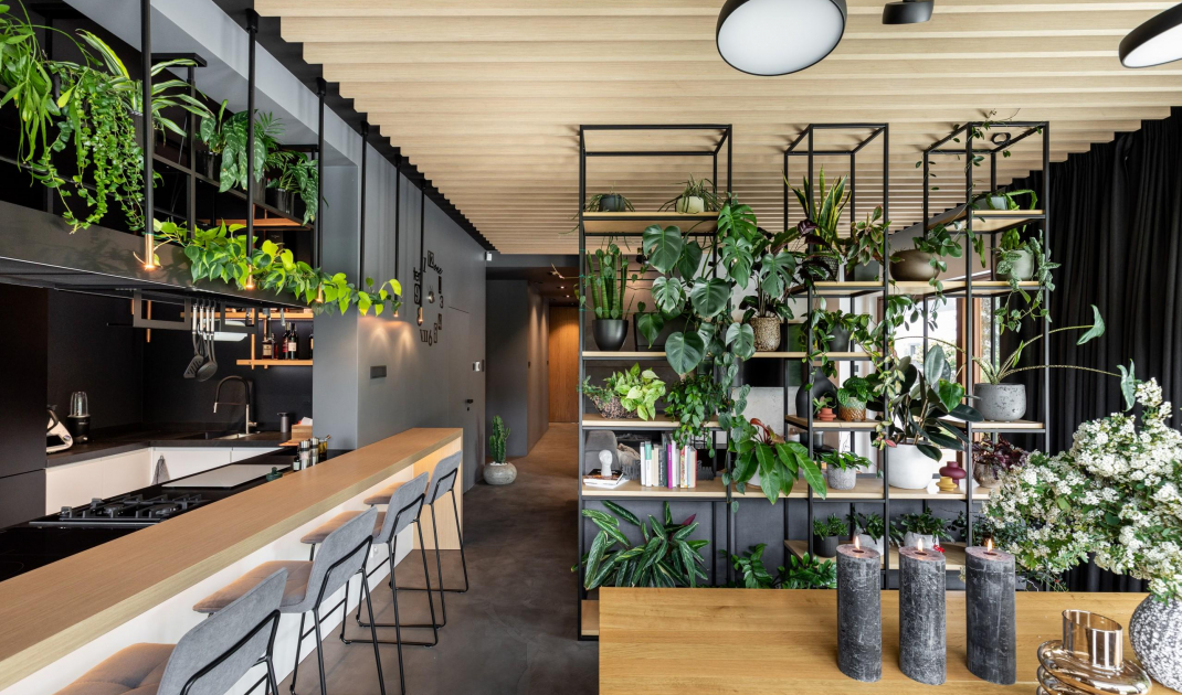
The space of this 125-square-meter apartment located in Cracow's Wola Justowska district is the result of combining two smaller adjoining apartments. Architaste studio is responsible for its design.
The interior is filled with plants
© Architaste
Two zones
The apartment has been divided into two zones. The living zone includes an entrance hall, living room with dining room, kitchen, bathroom and guest room. The private zone includes a spacious bedroom with a walk-in closet, a study, a laundry room and the owners' private bathroom accessible from the bedroom. The two zones are connected by a long, yet pleasant and atmospheric corridor.
The two zones are connected by a cozy corridor
© Architaste
Bold choices
Raw materials are combined here with simple geometric forms. The cement floor, textured to resemble concrete. It was designed at the request of the owner, who likes bold aesthetics. The owners wanted to achieve an elegant, timeless and atmospheric interior using simple means. The raw finish of the walls and floors contrasts with the warmth of wood, used on the sliding doors, ceiling and in the accessories.
Raw materials are combined here with wood
© Architaste
In a good rhythm
An important role in the interior is played by rhythm, i.e. the use of the same element in greater numbers. This procedure makes a seemingly very modern interior become elegant and acquire a classical element. We can see it, for example, in the arrangement of the lamellas on the ceiling, as well as in the arrangement of the lamps over the island, which resemble a classical colonnade.
The arrangement is rhythmic
© Architaste
Contrast and rhythm
The interior gains its appeal from the use of many contrasts and the combination of different structures and materials. The classic base of the interior is contrasted by numerous asymmetrical forms. A great example is the ceiling in the living room, whose rhythmic structure contrasts with irregularly placed lamps. We can have the impression that the lamps randomly, like mushrooms after rain, grow out of the ceiling.
The lamps have been placed irregularly on the lamellar ceiling
© Architaste
Are you decorating your apartment? We have more inspiration for you!
Compiled by:KATARZYNA SZOSTAK


