Natural materials and a mix of structures and colors. This is the interior of the house of architect Hanna Pietras. Where did the idea for such a space come from? What was the biggest challenge for the architect and also the owner of this space?
Concrete was used on the ceiling of the living area
Photography and styling: Follow The Flow Studio
A real challenge
What is the most difficult thing about being an architect? Definitely designing a space for yourself and your family. Endless ideas, but also knowledge of the solutions available on the market made the process of arranging these interiors a challenge.
The architect emphasizes that designing one's own home is the biggest challenge
Photography and styling: Follow The Flow Studio
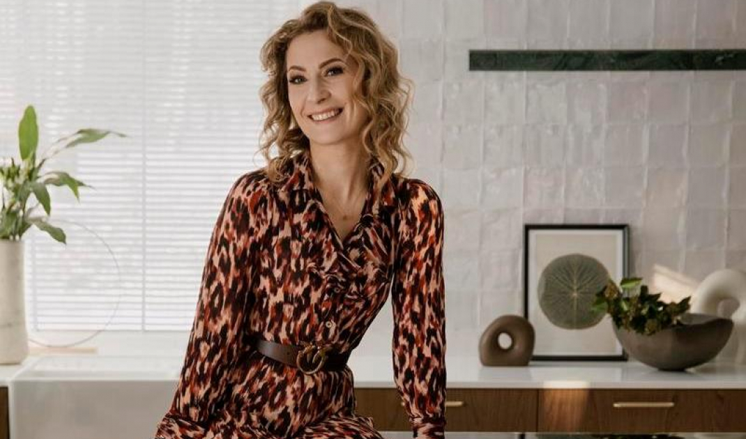
- This project stirred up a lot of emotions in me and my husband from the beginning. We bought a house in a beautiful neighborhood where we walked a lot. Our dream place. We really had a lot of ideas, until at some point we both decided that we needed the help of an outsider who would harness our imagination and take a rational approach to designing this space. This more than 180-square-meter house would not have been created without the help of an architect from my studio - Ania Petrovy, who has a brilliant sense of taste and, interestingly enough, a completely different perspective than I on many design issues - says architect Hanna Pietras.
The interior combines raw finishes with warm woods
Photography and styling: Follow The Flow Studio
Eclectic combinations of materials
Hanna Pietras loves eclectic interiors and knew from the beginning that her living space had to be like this, too. At the same time, the forest surroundings of the house influenced how the various rooms were decorated. One can see the inspiration of nature both in the patterns and in the numerous wooden accents. The living area, which consists of the kitchen with dining room and living room, is a balance between warm and cold colors, but also materials. On the floor you will find wood. On the ceiling, however, raw concrete was used. This was an architect's dream. There is no lack of natural stone here either. And this is due to the original kitchen island.
- I love natural materials and dreamed of such an island. From the beginning I wanted an island to stand in this open space, which in its form is light, but at the same time is a strong accent in the interior, including color. An interesting feature is the lighting on its other side, above the countertop. It looks as if it too, is made of the same stone, but it is just a happy coincidence - adds the architect.
Copper sofa in the lounge area
Photography and styling: Follow The Flow Studio
Gems of vintage
The use of concrete, however, does not mean that the interior is cold and austere. Just look at the sofa, in a beautiful copper shade. Right next to it is a rug, which perfectly complements this space with warm colors, while giving a touch of modernity. However, when you look the other way - you will see a vintage whey, as well as chairs designed by Marcel Breuer.
Desk and whey vintage
Photography and styling: Follow The Flow Studio
The living area also features a glass-enclosed study with a vintage desk. The furniture comes from the private collection of the architect's mother and is more than 70 years old. The glazing makes the owners see what's going on in the living room or kitchen despite their professional duties and makes the space seem visually larger.
Glazed study
Photography and styling: Follow The Flow Studio
Are you decorating your apartment? We have more inspiration for you! ClickHERE
Compiled by:KATARZYNA SZOSTAK
