Combining two adjacent apartments into a coherent, harmonious and comfortable whole became the key challenge of arranging this space. The task was undertaken by Jacek Tryc. We have previously presented the children's rooms, the playroom and the cinema room. Now we will look at the rest of the apartment.
Living to be together
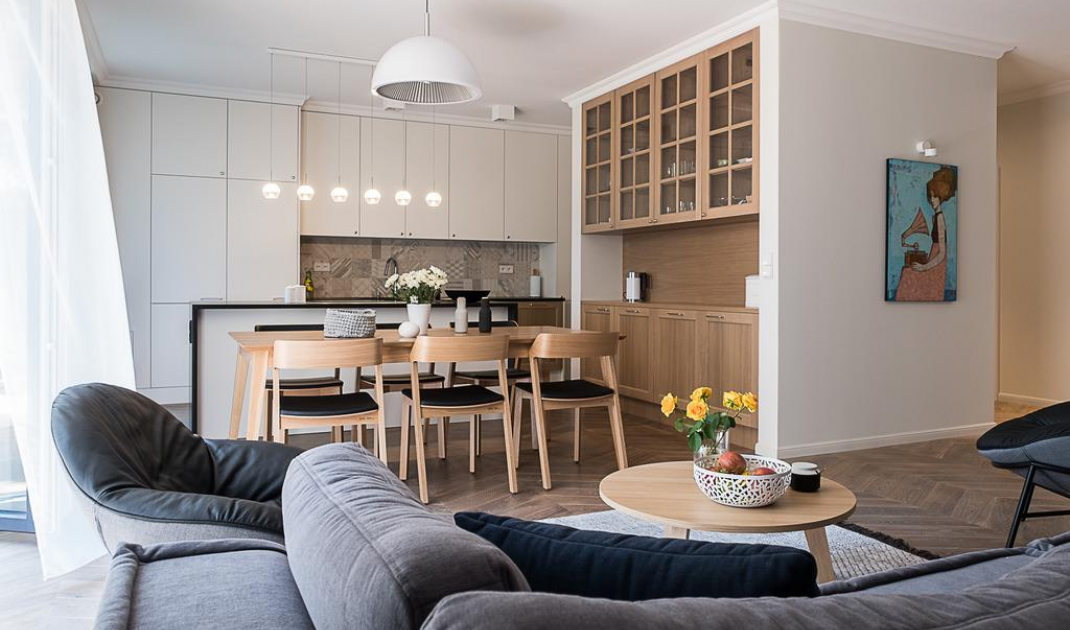
How did the architect translate the needs of future users into the language of interior design? He made the heart of the apartment a spacious living area, the focal point of which is the table. Around it the life of the whole family is concentrated, meals and meetings are held at it. On one side of this piece of furniture is located the kitchen, on the other the living room. Characteristically, next to the sofa you will find a library, but there is no TV.
- All this is done so that those who stay here actually spend time together," explains Jacek Tryc.
All rooms - including the hallway and bathrooms - feature the same floor, herringbone oak. It presents itself quite traditionally, but it is a layered plank, very stable. In addition, throughout the apartment you will find only one wall color, one type of wood, one furniture formula. This moderation perfectly organizes the space, but also gives it a timeless look.
Living area
Photo Jacek Tryc
Kitchen
Open to the living room, the kitchen is divided into two parts. Closest to the already mentioned large table with chairs was a spacious built-in unit with the shape and function of an oversized sideboard. All the furniture mentioned here was created from oak.
- We chose and used natural wood, without imitations. There are several reasons for this, but one of the most important is that such materials age nobly. They live and mature with the user. This is an important aspect of designed interiors for me," points out Jacek Tryc.
Kitchen
Photo Jacek Tryc
The utility zone, where meals are prepared, cooked, fried and dishes are washed, is located deep in the room. Minimalist white fronts dominate here, contrasted with the black of the stone countertops. The island, which is parallel to the table, also has the same color scheme. Visual minimalism is used so that the kitchen does not dominate the living space, but at the same time is fully functional. This has been achieved, among other things, thanks to countertops milled in such a way that the cooktop or drainer do not compete with the working space.
It is worth looking at the island, which clearly expands the work space. Although it covers some of the equipment (such as the oven) and hides others (such as the hood that slides out of the countertop), it does not cut off the kitchen from the living room, does not divide the space, but on the contrary - unites them. It makes it possible to cook together, allows you to guard children playing in the living room, and facilitates parties. Thus, it clearly fits into the principle of turning the entire apartment - including the kitchen - towards the table.
Living room
After the two apartments were combined into one, the apartment opens onto a private garden on three sides. Whenever the weather permits, the homeowners are eager to enjoy its charms. When the sun is lacking, they like to sink into reading.
- It's good when books are at hand, in the living room. This encourages more frequent reading. As opposed to when they stand closed in glazed cabinets in the study, for example," points out Jacek Tryc.
The elegant, simple oak bookcase he designed visually organizes the fever of colorful covers. The sofa is a modular model, so it can be unfolded to, for example, turn the sofa into two armchairs. The structure of the furniture allows you to easily adjust it on the fly to the immediate needs of users. The equipment of the rest area is complemented by two comfortable but light armchairs and a low coffee table. In the evenings, the whole area is illuminated by lamps with a pleated motif.
Living room
Photo: Jacek Tryc
Hallway
The corridor, which greets both householders and guests crossing the apartment's door, also connects the living area with private rooms. Since there is a spacious dressing room at the back of the sideboard, here decorative wood-turned hangers and a small nabuty cabinet are sufficient. The decoration of this area is a painting painted by a well-known Warsaw artist, Michal Warecki.
Hallway
Photo Jacek Tryc
Bedroom
The small bedroom was filled with a wide, comfortable bed with a soft, upholstered headrest - The central location of this piece of furniture emphasizes the main function of the room. Main, but not the only one, because although there is no place to work, for example, the wall opposite the bed was filled with a minimalist closet. With its light, discreet, modern forms, the arrangement promotes tranquility and regeneration.
Bedroom
Photo Jacek Tryc
Bathrooms
Finally, let's take a look at the bathrooms. In the smallest of them - in fact, in the toilet next to the living room - there was only room for a toilet and a sink. The beauty of the interior is mainly determined by the interesting color scheme and the noble simplicity of the materials used. An interesting treatment is the repetition of the herringbone pattern from the floor - on the wall. Consistency has also been maintained through the use of a solid oak countertop and the selection of the same fixtures for all bathrooms.
Toilet
Photo Jacek Tryc
The parents' bathroom was equipped with paneled cabinets. They not only enlarge the room, but also accommodate cosmetics and toiletries. An important piece of equipment is a bidetta, which is a special shower handset that enriches the toilet area with the advantages of a bidet. The minimalist arrangement of the bathroom is complemented by a slim shower tray flush with the floor.
Bathroom
Photo Jacek Tryc
Are you decorating your apartment? We have more inspiration for you! Click HERE


