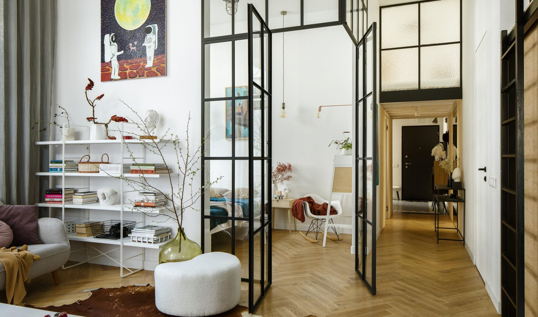
The 80-square-meter apartment was to become a home for two adults, four children and a dog. The designer decided to take advantage of the apartment's height and created 25m2 of additional space using mezzanines.
Kitchen
Photo: Yassen Hristov
Styling: Magda Chudkiewicz @soryzabalagan
The cooperation between the architect Maria Rauch and the investors took place in an unconventional way. This is because the owners decided to use an architectural consultancy. This service is much cheaper. This is because the investors took care of the measurements and workmanship. The designer, on the other hand, provided advice on technical and spatial issues.
- Our main problem was a flurry of thoughts and ideas while lacking the professional tools to realize them. The need to synthesize, advise and open our minds were essential to move forward. For us, the biggest benefit of the architectural counseling was to systematize the concept, get a sense of security, set the main directions and have a coherent vision of the whole idea for the interior," the owner describes.
Living room
Photo: Yassen Hristov
Styling: Magda Chudkiewicz @soryzabalagan
The counseling was particularly apt in this case, since the owners already had their idea for the interior. Because of their profession, handling textures, light or colors comes easily to them. The designer was given a thirty-page presentation showing this very vision. However, the key to a successful project turned out to be...social media.
-My inquisitiveness and this time turned out to be a hit. Among other things, I received a link to Instagram, which allowed me to take a peek behind the scenes of the clients' daily lives. The photos absolutely captivated me - and it wasn't at all that they were taken by professionals. They revealed a family in its full glory, which likes to cauldron together on one couch, cuddle, feel closeness, spend time together," Maria Rauch describes.
Bathroom
Photo: Yassen Hristov
Styling: Magda Chudkiewicz @soryzabalagan
Both parties knew it was necessary to take advantage of the height of the 3, 70-meter apartment and create mezzanines. The designer proposed as many as five of them. This way each household member has a zone to himself. It was also possible to create cozy common spaces. Two of the mezzanines are located above the children's hallway and bathroom, making them an integral part of their rooms. Another mezzanine was built over the bed in the parents' bedroom. The last two were connected by a passageway over the main bathroom and kitchen.
Bedroom
Photo: Yassen Hristov
Styling: Magda Chudkiewicz @soryzabalagan
One in particular draws special attention. The mezzanine was designed for spending time with the family. Among other things, this space is meant to be used for watching movies together from the projector. So it has been filled with pillows and mattresses that will make an evening screening more pleasant.
Mezzanine in the children's room
Photo: Yassen Hristov
Styling: Magda Chudkiewicz @soryzabalagan
Expanding the entrance space turned out to be another important aspect. This was accomplished by abandoning the dressing room and making one of the children's rooms smaller. What's more, a tunnel, a lowering resulting from the mezzanine planned above, also appeared in a section of the long, previously unattractive corridor. Now the hallway has a large built-in closet and a coat rack. Slightly further down, it was possible to cleverly hide the washing machine and dryer.
Girls' room
Photo: Yassen Hristov
Styling: Magda Chudkiewicz @soryzabalagan
In such a project it is important that not an inch of space was wasted. The architect proposed solutions that allowed to use all the space to the maximum. One such clever solution is storage under the stairs. Another, the use of the mezzanine where daylight does not reach for the installation of a photographic darkroom.
Girls' bathroom
Photo: Yassen Hristov
Styling: Magda Chudkiewicz @soryzabalagan
Are you decorating your apartment? We have more inspiration for you! Click HERE


