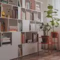
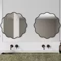
Yesterday on our portal we presented the design of the common area of the house designed by the architectural studio The Wall (See here!). In this text we will move on to the private area - the attic.
Wood texture defines part of the bedroom space
Photo by Magdalena Łojewska Vey photography, © The Wall - Pracownia Architektury
Colorful renovation
During the adaptation of the house, it was important to arrange the attic space that has not been used so far. This is the part where the children's room, bathroom, gym and a bedroom are located, with room for the part called "office-creative" by the architects.
This foreshadows that each of the rooms in the private area is a different story - and has a distinct color scheme," points out architect Patrycja Sliz.
The owners' private space - the bedroom
The room, where the bedroom was located, is also intended to perform unique "creative-office" functions. It is also to be used for work, not just for rest. The interior was defined by three colors - a dark shade of wood, graphite and bleached pastel mint. The share of furniture in this interior has also been kept to a minimum, giving the interior the minimalist character we know from the rest area.
The delicate mint stands out against the gray-wood background
photo by Magdalena Łojewska Vey photography, © The Wall - Pracownia Architektury
toilet
In the toilet, the architects again decided on an unusual color solution - black combined with pale and strong yellow. In addition, strong gold was decided in several accessories and furniture. This toilet is reminiscent of the realization in the rest area of the house, where a monkey figure was used (See here). The toilet space is small, but sufficient for the needs of the residents.
The toilet is dominated by black and yellow
photo by Magdalena Łojewska Vey photography, © The Wall - Pracownia Architektury
children's kingdom
Theroom is intended for a young girl, hence the placement of the dominance of white and delicate shades of beige, which were broken by dark wood. The dominant color used in the furnishings is a delicate light gray. On the floor, it was decided to use panels arranged in a herringbone pattern. The most important thing was to create a space in which the architects' daughter would feel at ease, spending time on carefree play.
Pink and beige - this is how the children's space was created
photo by Magdalena Łojewska Vey photography, © The Wall - Pracownia Architektury


