The starting point for the design of the apartment was the appearance of the moon. Anna Błaszczyk of the Artewizjon studio is responsible for the project. The apartment received the title of Award Winner in the Residential Interior Apartment category of the European Property Awards.
Function and space
A two-story apartment in a prestigious district of Warsaw was to be turned into a home for a family of four. To achieve this result, it was necessary, first of all, to plan functional issues from scratch. At the same time, the ambition of the author of the project was to develop the square footage in such a way that the sense of spaciousness was not lost.
- The most important issue around which discussions took place was how to open or close the mezzanine space in relation to the lower floor of the apartment. I advised the investors to separate the rooms on the upper level so as not to lose the feeling of space on the lower level, but actually emphasize it. I also suggested glazing the walls to open or close the views, depending on current needs, but to isolate the individual rooms acoustically - says the architect.
Meeting the investors' expectations required significant changes in the original layout of the rooms. The kitchen was created in place of the initially planned living room. A pantry appeared at its back and also one of the dressing rooms appeared on the side of the hallway. The second - as well as an additional bathroom - was designed on the upper level, where, in addition to the master bedroom, there were children's rooms. The development of the upper floor was created from scratch, as the developer envisioned a fully open mezzanine there.
Author of the project Anna Błaszczyk of the Artewizjon studio
Photo: Michal Przeździk-Buczkowski/Budzik Studio
In the light of the silver globe
The moon played a special role in the project, which gave its character and name.
- Through the windows of the two-story living area, the sun shines in during the day and the moon at night. Investors were captivated by the proposal to allude to the silver globe with a wealth of textures and lighting effects - recalls Anna Błaszczyk.
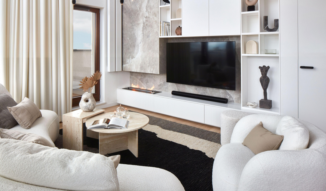
Textures inspired by the moon's surface appear, among others, in the form of quartz sinter with a salt rock pattern in the housing of the bio-fireplace and natural travertine, from which the coffee tables are made. There is something of the moonlight in the mirrors - including those in the lobby and by the dressing table in the bedroom. In addition, the silver globe became the protagonist of the artwork, which the designer personally made in cast resin technique. The owners displayed it in the dining room.
The interior is inspired by the moon
Photo: Michal Przeździk-Buczkowski/Budzik Studio
The apartment's color scheme was subdued from the beginning, based on off-white and related shades. Against such a background, various carefully selected elements of furnishings and decor stood out in successive versions of the project. Nevertheless, the investors were in agreement with the designer, in that "less is more." An important component of the project from the beginning was also the intentionally free space, filled only with light and air. The balanced interior design is based on a dialogue of expressive verticals and levels with organic forms that break, soften and balance the geometric themes. Thanks to this, the whole is exceptionally harmonious.In the subsequent phases of the project, the variants of materials and models of furniture and lamps changed, and the composition of the wall with the bio-fireplace and television gradually matured. What remained unchanged from the stage of initial assumptions to the final version of the project and implementation, was the elaborate lighting. In addition to visually striking lamps, there were countless fixtures recessed into ceilings, furniture built-ins and wall coverings, among others.
In the small hall, the developer used a staircase that is not very comfortable and safe in a house with children. Hence the decision to build a two-legged staircase with a landing. The small opening in the ceiling was also a challenge. The use of wall-mounted treads, glass balustrades and large panes of mirrors made it possible to achieve an impression of lightness. The staircase seems to float in the air.
The biggest advantage of the aparament is the open space
Photo: Michal Przeździk-Buczkowski/Budzik Studio
Open space
The biggest ornament of the two-story living room is the light-filled space. To emphasize it, the architect decided to place here a large lamp with fig fruit-shaped holders hanging on long wires. The composition of the interior also required appropriate development of a high and rather narrow wall. On it was placed a bio-fireplace and a TV set. Around both of these elements was created a development with shelves of two depths. In this way it was possible to disguise the course of the subsequence that divides the wall halfway up. The quartz sinter with a salt rock pattern resembles the surface of the moon. The delicate texture meets here with a wealth of other structures, including the thick weaves of upholstery fabrics or carpet, the grooves of furniture fronts, the unglazed clay of the vase, etc. The varied structures enrich the soft, almost monochromatic color scheme of the interior.
Quartz sinter in the living room resembles the appearance of the surface of the moon
Photo: Michal Przeździk-Buczkowski/Budzik Studio
With a sculptural touch
The huge, 3.6-meter-long kitchen island with capacious cabinets is covered with quartz sinter with a structure imitating travertine. The stone pattern meets here with fluted and smooth fronts of the furniture development. Complementing the work flow is a high built-in cabinet on the perpendicular wall, as well as a pantry hidden behind it. Hanging lamps made of natural wood relate to the floor in a specially selected caramel shade of molde oak. They have a lot of sculpture in them, so they also look impressive from above - viewed through the glass walls of the master bedroom on the upper floor. The light colors, dominant in the kitchen, are neatly broken by dark details - comfortable hockers, smooth panels of household appliances or fixtures.
Above the long kitchen island hang sculptural lamps
Photo: Michal Przeździk-Buczkowski/Budzik Studio
Work-life Balance
The owner couple is professionally connected with show business. Both also work a lot at home. A representative home office allows them, among other things, to record short videos for publication on social media. The master of the house has a passion for sailing, and on weekends the couple of apartment owners also like to get on their favorite motorboat. Therefore, they both wanted it to appear as a decorative motif in the study. The stylized image of the boat, made in a rarely used technique of printing on veneer, obscures the mundane function of the furniture, which is an archive of documents. The vertical garden not only creates a pleasant atmosphere, but also provides a favorable microclimate for work. Establishing it required distributing an irrigation system and calibrating the ventilation and lighting accordingly. A bright sofa and a round table complete the room.
A motif of a motorboat appears in the study
Photo: Michal Przeździk-Buczkowski/Budzik Studio
Bedroom with a wow effect
The master bedroom is a space for relaxation and regeneration. According to the investor's wishes, the interior was to be cozy and spectacular. The owner wanted to use it as a striking set for videos published on social media. That's why, in addition to the bed, there was a dressing table and a free-standing bathtub. For the time of bathing, the huge glass windows opening the interior to the first floor can be covered with fleshy curtains. Fabrics, which provide a feeling of coziness, also appear in the upholstery of the bed and armchair, in the background of the painting and the decorative cover of the air conditioner. The interior design, though discreet, makes use of a rich range of textures and a varied palette of beige and brown tones. Next to the master bedroom, the architect envisioned a large dressing room. The white fronts with delicate openwork used here obscure and soften the fever of colors of clothes.
At the request of the investor, the arrangement of the bedroom is very impressive
Photo: Michal Przeździk-Buczkowski/Budzik Studio
Bathroom with a touch of color
Located on the first floor, the bathroom has a similar style, but is distinguished by the warm yet striking salmon color used on the wall. It is connected to the laundry room. The entrance to it is located next to the toilet and has been shielded by a sheet of glass. The cozy character of the interior is emphasized by the use of ceramics in a matte finish and quartz sinters with a delicate terrazzo pattern. Contrary to appearances, this interior is not a completely separate patch of color. A careful eye will notice that the thread of this color also runs discreetly through the other rooms.
Salmon color appears in the bathroom
Photo: Michal Przeździk-Buczkowski/Budzik Studio
Are you decorating your apartment? We have more inspiration for you!
Compiled by:KATARZYNA SZOSTAK


