The homeowner likes raw style and dark colors. His partner, on the other hand, appreciates nature and bright colors. Martyna Banaszczuk managed to perfectly combine such divergent expectations.
Interior by Martyna Banaszczuk
Photo: Yassen Hristov Styling: Kamila Jakubowska-Szmyd
Soft transitions
The 330+ m² house is divided in the traditional, tried-and-true way into a living area on the ground floor and a private area on the first floot. The common area, where family and social life takes place, includes a living room with a dining room, kitchen and pantry, a secluded study, plus a guest bathroom and a vestibule with a dressing room and a mirrored passage to the garage.
A hallway with original decorations
Photo: Yassen Hristov Styling: Kamila Jakubowska-Szmyd
The presented house is the result of another collaboration between the architect and a couple of investors. Previously, it concerned office spaces, which allowed the designer to get to know the client's taste well.
- I knew that he liked a rather austere style, dark color tones and black accessories. These preferences, however, I had to combine with the client's needs, as it turned out, quite different. After all, the investor appreciates natural materials, especially wood, leather, appropriate fabrics and bright colors. The cozy character of the interior is important to her - the architect noted.
The interiors of the first floor are consistent and their open spaces softly intermingle. The individual functional zones are visually linked by the use of carefully selected materials. The seemingly austere materials, textures or hues used here exude warmth. A major role is played especially by the investor's favorite wood. It can be found here in the form of natural oak floorboards and veneer on furniture and wall coverings. Warm in feel, but hard and durable oak successfully overcomes the various functional challenges specific to each room, while giving modern interiors a lot of coziness.
Dining room with original lamp
Photo: Yassen Hristov Styling: Kamila Jakubowska-Szmyd
Living room connecting to the garden
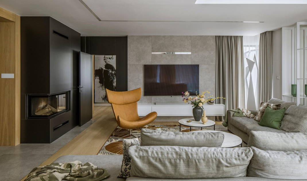
Oak flooring is the base of the living room arrangement. Martyna Banaszczuk selected the furniture to respond to the owners' love of fine materials and the range of earthy colors. A comfortable and spacious sofa is complemented by an enveloping armchair. An intriguing element of the arrangement is a carpet with a leaf pattern, which connects the interior of the house with the garden. It was made to size from a properly selected fiber. The carpet can be used both indoors and on the terrace. Thus, on warm days you can circulate freely between the living room and its extension in the open air without worry. The architect was very considerate in choosing decorations. Here stood a lamp with a sculptural form visible to the right of the TV. A functional addition to this part of the house is a hanging RTV cabinet and a lighted metal and glass bookcase with a mirrored back. This bookcase is an ideal place to display art glass and ceramics.
A leaf-patterned carpet connects the living room to the garden
Photo: Yassen Hristov Styling: Kamila Jakubowska-Szmyd
In the lounge area, an important function is performed by a linear system flush with the ceiling. When it flares up, it is visible as a delicate, decorative line of light that fills the interior with a soft glow. However, this elegant solution also has a second, surprising function.
- I know from experience that cracks can form after some time at the junction between the ceiling and the suspended ceiling on the first floor. To avoid this, I decided that we would anticipate the course of events, while at the same time achieving an interesting and lasting effect - explains the architect.
Decorative light line under the ceiling
Photo: Yassen Hristov Styling: Kamila Jakubowska-Szmyd
An office full of art
Art can also be found in the office. Large-format black and white graphics by Jarek Kubicki hang on the walls. The office itself, although separated from the living room, is closely connected with it stylistically. The bookcase placed in it, designed by Martana Banaszczuk, displays decorative trinkets and favorite books. Smooth doors and lamellar panels obscure other necessary but visually unattractive items. The most important piece of furniture, however, is a magnificent desk with a black stone top. An interesting contrast is created by juxtaposing it with a soft velvet sofa.
Oak bookcase designed by Martyna Banaszczuk
Photo: Yassen Hristov Styling: Kamila Jakubowska-Szmyd
Island made of unique stone
-The owners like to cook, so despite the relatively small area the kitchen had to be as comfortable as possible. Investors were very keen on the island, which in this case limits the space. This challenge was overcome with capacious wooden built-in furniture. The furniture visually merges with the living room design and hides a real arsenal of small and large household appliances - explains the designer.
The island was made of Patagonia quartzite
Photo: Yassen Hristov Styling: Kamila Jakubowska-Szmyd
The dream island was created from natural Patagonia quartzite. It is an extremely impressive stone, distinguished by an insanely expressive vein pattern. It is characterized by high resistance to damage. At the same time, it is as easy to clean as granite. The fullness of its decorative qualities is brought out by the lighting hidden under the countertop. After turning it on, the semi-transparent parts of the mighty rock gain a golden aura. The architect placed an induction hob on the island, thus closing the functional triangle consisting of a refrigerator, sink and kitchen. At the island stands hockers, twinned with the chairs surrounding the dining table. Above, there are lamps and a hood. To get the right ceiling for these appliances, the architect introduced a wooden panel. It's worth noting that this element is a visual extension of the built-in, and what's more, it recurs in many other parts of the house.
Quartzite can be illuminated
Photo: Yassen Hristov Styling: Kamila Jakubowska-Szmyd
Are you decorating your apartment? We have more inspiration for you! ClickHERE
Compiled by:KATARZYNA SZOSTAK


