The Krakow interior in black and white color scheme is not the first such solution we show. The arrangement avoids breaking up the color scheme by additional elements, betting on the choice of unusual bookcases and classics of Scandinavian design. The design by The Wall studio is a unique combination.
The hallway is a dynamic interior, full of unique shapes
photo by Magdalena Łojewska / Vey Photography, © The Wall
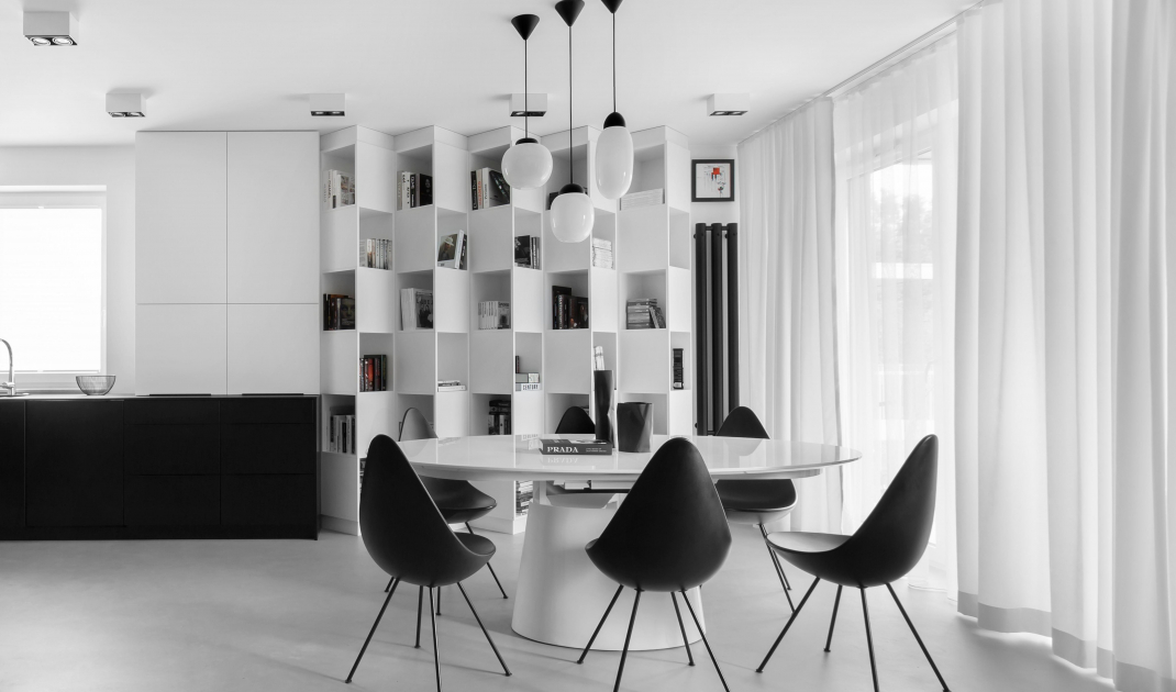
The investors were primarily interested in minimalism and modernity. They wanted to create a unique and elegant space with a distinct black and white color scheme. The choice of contrast of these colors does not seem strange, but in this realization it was used to the maximum. Equally important was the choice of furniture: classic Drop chairs designed by Arne Jacobsen and unique bookcases.
A bookcase like no other
The most important element of the living room is the bookcase. The designers wanted it to be the dominant feature of the room and not to resemble standard solutions - they proposed a modular set consisting of rows of cubbies that turn alternately to the left and right. In this way the solid was differentiated.
[Investors - editor's note] They both like to read, and the investor additionally has many specialized medical items," recalls architect Patrycja Sliż of The Wall studio.
The heart of the living room is an unusual bookcase
photo by Magdalena Łojewska / Vey Photography, © The Wall
Next to it was a white table with an oval top, which creates the impression of levitating above a truncated cone. The table is surrounded by the aforementioned Jacobsen-designed chairs - black and minimalist design to complete the overall picture. The whole is complemented by black, giving the impression of "bent" vases from Ćmielów, designed by Marek Cecuła. The only element of the living room that stands out in terms of color is the caramel carpet, located next to the sofa.
The contrast of white and black is defining here
photo by Magdalena Łojewska / Vey Photography, © The Wall
kitchen continuation with wooden accent
The kitchen is connected to the dining room and living room. The lower cabinetry is kept in black tones, the upper in white. This is an interior where a more elaborate color accent - veneer cabinetry - was chosen.
In a sense, in opposition to the horizontal stripes of black and white, the high cuboid of the built-in received a veneer finish with a rich grain pattern. In this way, we responded here to the owners' clear need for contact with natural materials," notes Patrycja Sliż.
Wooden veneer is a distinctive element in the interior
photo by Magdalena Łojewska / Vey Photography, © The Wall
The uniform concrete floor is also important. Gently rough and cool in appearance. The choice of such a floor solution helps strengthen the impression of a uniform color scheme.
Attention in the interior is attracted by details
photo by Magdalena Łojewska / Vey Photography, © The Wall
private space
While in the living room and kitchen the white and black tones remained in harmony, in the toilet and bedroom the dominance of black was relied on. However, as in the kitchen, wooden elements appear - bed frames and bedside tables. One of the two toilets was equipped with a wooden floor.
in the bedroom and one of the toilets there is a predominance of black and a greater presence of wood
fot Magdalena Łojewska / Vey Photography, © The Wall
richness of shapes
What distinguishes the interior is also the richness of shapes. It is worth noting how the hallway was solved - full of irregular, curved lines that build this interior. The interior is characterized by minimalism in the color solution and limitation of objects. Dynamics is maintained mainly by unusual solutions, such as the dynamics of shapes and small breakdowns of tones by means of wood.
Caramel carpet is the only such element in the living room
photo by Magdalena Łojewska / Vey Photography, © The Wall


