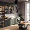
What to lining the wall above the kitchen countertop? This question is asked by everyone who is decorating a house or apartment. We rush with the answer and 6 diverse inspirations from Polish interior designers!
Original design
The original design of this kitchen is the work of the Poco Design studio. Unorthodox color combinations and interesting textures and forms create an artistic arrangement. The upper cabinets in a shade of pale pink were juxtaposed with bottle green on the fronts of the lower cabinets. In between, however, you'll find colorful terrazzo. The pattern, which refers to the 1970s, brings a bit of retro atmosphere to the interior.
Kitchen in shades of pink and green
© 3d render: Mateusz Jakubczyk
Learn more about this project
Elegant gray
The apartment by MM Architects is located right next to the Wawel Castle. For this reason, the designers opted for a retro style. The room where the kitchen is located is high, but narrow. For this reason, white cabinetry divided into two sides was used, as well as glossy tiles that optically enlarge the space.
The interior is distinguished by a cradle ceiling
Photo: Jeremiasz Nowak, style. Anna Bacik, © MM Architekci
Check out the kitchen opposite the Wawel Castle
To the middle
The kitchen from Polanski.studio was decorated in the japanese style. Due to the open layout, the architect delineated the different zones with finishing materials. Thus, on the floor in the annex you will find gray tiles with a terrazzo motif, while in the living room panels were used. Similarly, the space above the countertop was also divided. The lower part of the surface between the cabinets is lined with tiles. This protects the wall from dirt. The zone closer to the upper cabinets was painted a warm shade of beige. In this way, architect Tomasz Polansky created a light and cozy arrangement.
The architect delineated the functional zones with finishing materials
Photo by Patryk Polewany
Visit the kitchen in the japanese style
Juicy green
The arrangement from KODO studio is distinguished by glossy dark subway tiles. Placed over the countertop, the tiles add character to the whole arrangement. Moreover, they contrast beautifully with the white fronts of the kitchen cabinets and wooden countertops. Instead of upper cabinets, the architects decided on a long shelf. Thanks to this, the arrangement gained lightness. The bulb-shaped lamps hanging on a black cable add an industrial flair.
Green subway tiles add variety to the white kitchen
© KODO
Take a look at the apartment from the KODO studio
Contrastingly
Magdalena Daszkiewicz 's realization from PRZESTRZENIE studio is built on opposites. The fronts are kept in a soft, bright blue. While the fixtures and lighting introduce matte black. The wall cladding above the countertop is also contrasting. White glazed ceramic tiles are joined by black grout. This classic yet distinctive juxtaposition creates a stylish arrangement.
White tiles have been juxtaposed with contrasting black grout
Photo: Mikolaj Dabrowski, © PRZESTRZENIE
Read more about the project by PRZESTRZENIE studio
With backlighting
Anna Maria Sokolowska created a kitchen in which onyx plays the main role. The ornate stone covers the entire wall above the countertop. It was mounted on a special steel-frame frame. Investors can also illuminate it, which, especially in the evening, gives an amazing effect.
Kitchen with illuminated onyx
Fotomohito
Learn more details about this project
Are you decorating your apartment? We have more inspiration for you!
Elaboration:KATARZYNA SZOSTAK


