The house, designed by Gabriel Helegda of Helegda Studio, was decorated in the chalet style. The interior is filled with aged wood juxtaposed with modern design.
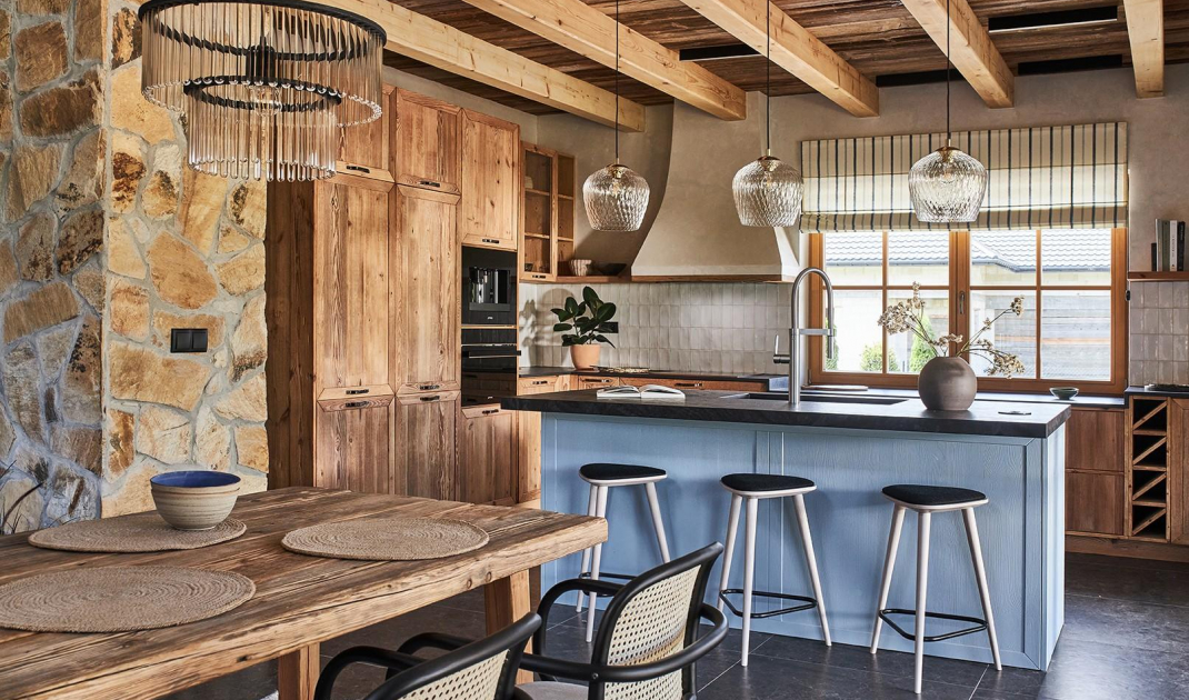
The kitchen is separated from the dining room by a chimney wall made of hewn stone
Photo and styling: Budzik Studio
A stylistic mishmash
A large table stood on a carpet inspired by old Zakopane kilims. The tabletop was made from the face of a beam, which for the last several decades was part of the facade of an old cottage.
- It is a hand-cut material. It has been cleaned, smoothed a bit, but fully preserved, with visible cracks and traces of time - Gabriel Helegda explains.
View of the dining room from the second floor
Photo and styling: Budzik Studio
Curved armchairs with Viennese plaid were placed next to it, and a chandelier named Maria SC referring to Marie Sklodowska-Curie was hung above the tabletop. A unique lamp was made from vials, resembling those of a laboratory. By the window there is a modern display case. In its glazed part, the owners store glassware and china. The closed cabinet are used as a bar for luxury liquors. This unprecedented juxtaposition of very distinctive elements, makes the whole look light and elegant, despite the massive table.
The table was created from the face of a beam that was part of the facade of an old cottage
Photo and styling: Budzik Studio
Beauty of non-ideal nature
The kitchen is symbolically separated from the dining room by a chimney wall made of hewn stone, to which a goat-type stove was connected. The annex has been located slightly in the depth of the living room. The entire built-in is based on the architect's design and was done by a carpenter from a Warmian manufactory. The kitchen furniture was created from aged pine, which came from demolition. Because of the window, but also so that the wood would not overwhelm the room, the built-ins were limited to the lower row of cabinets only. In their place, shelves were installed - over glazed white tiles reminiscent of old stove tiles. The walls were rubbed down with decorative plaster. This gave a very natural effect to the uneven, slightly patinated surface. The deficit of upper cabinets is compensated for by the adjacent wall, built up with cabinets up to the ceiling. It hides mainly large household appliances. The fronts of the furniture are decorated with typical frames and simple steel handles. The exception is the cabinets under the window sill, which have been somewhat simplified.
The kitchen cabinetry was created from aged, demolished pine
Photo and styling: Budzik Studio
- In the design of the house, the window was set at a lower height than we normally plan for countertops. I wondered what to do with this and came up with the idea to make deep drawers in this lower section instead of classic cabinets. They have a slightly different front design that sets them apart from the rest. The drawers go into the window sill with the countertop, creating additional space under the window - the owners will be able to develop it with beautiful jars for storing food or herbs in pots - says the architect.
The kitchen cabinets were created based on the architect's design
Photo and styling: Budzik Studio
Modern solutions inspired by the past
The eye-catching element is the hood. The architect designed it on the model of old chimney hoods. The wooden structure was clad with plasterboard and finished with the same plaster as the wall. A foundation of old wood was made from underneath and an air filtration device was hidden in it. In the center of the kitchen stood a piece of furniture, which is a strong accent and gives color to the whole interior.
Above the countertop hang lamps made of ornamental glass
Photo and styling: Budzik Studio
The large island was made of aged wood and painted blue. The countertop is wide enough to accommodate the entire wet area, with a large sink. On the dining room side, you can sit on modern hockers placed next to it. Lamps made of ornamental glass were hung above the countertop. The designer initially proposed to cover the island and other cabinets with a black granite countertop. However, the owner dreamed of conglomerate, which she saw in another of his realizations. That concept was implemented. The material has a distinctive pattern that forms a network of blue and navy veins. It resembles wood and natural stone. This gives a very interesting effect and harmonizes nicely with the flooring throughout the house. Large-format porcelain stoneware tiles with an original drawing were laid on it. Depending on the incidence of light, they change their color to graphite or more brown, and the small pebbles embedded in the mass, like grains of sand, shimmer, creating an interesting structure.
- They have another practical advantage. No dust or other dirt can be seen on them, so the owner should be satisfied - laughs the architect.
The island was made of aged wood and painted in a blue color
Photo and styling: Budzik Studio
Are you decorating your apartment? We have more inspiration for you!
Elaboration:KATARZYNA SZOSTAK


