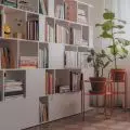
Hanna Pietras in cooperation with Martyna Florkiewicz created a minimalist interior for a married couple with two children. The arrangement of the 140 m² house is based on a subdued color base and simple forms.
Bedroom with striped wallpaper
Photo: Raspberry Workshop
Colors of nature
The main material here is wood. It provides a perfect background for the whole interior, while adding to its atmosphere. The wooden dining table perfectly harmonizes with the micro-cement spout, which is the quintessence of minimalism and simplicity of form.
- As the design called for a subdued but warm color palette, I took inspiration from nature and earth colors. The sand-colored microcement flooring, wood and beige natural fabrics bring to mind a walk on the beach on a sunny day - says architect Hanna Pietras.
Did the owners know from the beginning what kind of interior they wanted to live in?
- The investors had several different, sometimes contradictory visions. Which did not surprise me, but required me to catch those nuances that would allow me to design a coherent space. Throughout the design process I am greatly helped by conversations with my clients. Thanks to them I know how they function in the space, what their lives are like and what they are like. If someone is a perfectionist, he won't find himself in colorful interiors, filled with furniture and accessories. And in this case, the investor is definitely a minimalist and loves to have everything hidden! Here, minimalism worked best, where every accessory was chosen carefully and had to have its justification in the space - says Hanna Pietras.
A sofa in the living room and fluting in the hallway
Photo: Raspberry Workshop
A non-ideal break
The kitchen was equipped with a lot of cabinets and storage space. This avoids a sense of chaos in the room. The juxtaposition of white with dark gray cabinets is a great way to break the monotony in the interior. An interesting accent at the kitchen island are hockers. Their non-ideal shape is an intriguing contrast to the rest of the room.
The kitchen's built-in cabinets
Photo: Raspberry Workshop
Consistency of colors
Consistency in color and design can be seen especially in the living room. The fronts of the RTV cabinets correspond perfectly with those in the kitchen. Likewise with the color palette. Although the space is bright and minimalist furnishings make it cozy. Much of this is due to the sofa and table, which catches the eye with its round form. The carpet with colorful accents woven into the pile adds color to the interior. It is accents such as pillows, a decorative lamp and ceramics designed by Ula Michalak that build this interior.
The living room was decorated in subdued colors
Photo: Raspberry Workshop
Distinctive accents
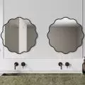
The bathroom is kept in gray. The decorative elements here are fluted fronts and a black towel rack that is let down from the ceiling. The bedroom was decorated in a similar style. In it, the attention is drawn to the gray wallpaper with a structure of thin stripes and a black wooden table by the bed. A decorative bedspread and a few soft accents such as pillows add charm and warm the interior.
Bathroom in gray
Photo: Raspberry Workshop
Are you decorating your apartment? We have more inspiration for you! ClickHERE
Compiled by:KATARZYNA SZOSTAK


