How to furnish a small apartment to be both bright and spacious? This challenge was taken up by the LBWA studio designing arrangements in a spatially limited interior in Poznan's Lazarus.
The closet was separated from the bedroom by a wall
photo: Pion Studio © LBWA
minor layout changes and a contrasting kitchen
The apartment is located in a new building, but the interior architects decided to slightly change its layout. They were primarily concerned with improving functionality and adapting it to the investors' needs. The changes involved removing part of the wall separating the living room from the kitchen to open up the space.
The kitchen 's built-in is intended to affect the living area by contrasting. This can be seen primarily in the dark metallic color scheme. Despite the opening, the kitchen was separated by a dark blue kitchen island. The fronts in the lower and upper part are dominated by deep, dark granite, which contrasts with the partial white cabinetry located around the kitchen.
The kitchen is meant to contrast with the living room
Photo: Pion Studio © LBWA
living area, or relaxation space
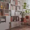
The living room, which creates a calm and gentle aura of relaxation, is primarily kept in white colors. On the walls it is difficult to find a breakthrough except for a small graphic behind the sofa and a bookshelf. Vertical radiators, almost sunk into the walls, were adjusted in an interesting way.
On the floor, a parquet floor laid in a herringbone pattern was decided upon. The furniture in this area was primarily intended to be light and unobtrusive. Their color scheme is simple, subdued and delicate. In addition to the classic color of wood, blacks and grays appear. It is worth noting an interesting lamp in the shape of a sphere suspended on a "broken" crossbar.
An interesting solution is a dresser specially designed for this interior, finished in oak veneer on a light black frame. Behind the sliding fronts hidden, among other things, audio equipment.
The attention is drawn by a unique lamp
Photo: Pion Studio © LBWA
over a sea of leaves
The night zone was created by combining two rooms, which made it possible to create a spacious bedroom with a separate area for a closet. The bed was made of solid wood, which gives it a minimalist, natural character. The wallpaper behind the bed also catches the eye, with a black and white natural thicket of plants, which naturally corresponds with the wooden furniture and plants placed in the bedroom.
In the bedroom, the wallpaper catches the eye
Photo: Pion Studio © LBWA


