We have already looked at the arrangement of the children's room, bedroom and bathroom by Karolina Dudek of Ubierz Wnętrze studio. Today we present the living area of a house in Kęty.
The interior combines modernity with classics
© Ubierz Wnętrze
A game of contrasts
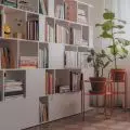
The interior was decorated in the modern classic style. The investors were keen on an efficient combination of modernity with classics and a touch of glamour. The open space consists of a living room, dining room and kitchen. To keep the arrangement consistent, the same finishing materials were used throughout the house. Thus, we can find here marble that already appeared in earlier rooms. The architect decided to play with contrast. The fireplace was highlighted by the use of black-colored tiles, while the wall with the TV was lined with the same white tiles that appear in the bathroom. In between, it was possible to create a bookcase on which owners can display stylish decorations. On the wall next to the fireplace you will find decorative stucco, which also appears in the hallway. This treatment also distinguishes the posters that decorate this part of the room. The lounge area is complemented by two large navy blue sofas. This gives the living room plenty of space to relax and receive guests. The boundaries of this zone are marked with a textured carpet. The cherry on top of this arrangment are two round coffee tables and gold designer lamps.
The contrast of marble tiles adds an interesting touch to the living room arrangement
© Ubierz Wnętrze
Subtle accents
A large table with a thick oak top and a metal leg in the form of a "spider" is the centerpiece of the dining room. The architect chose upholstered chairs with gold trim to match it. The whole is complemented by a white display case. Also worth noting is the delicate lamp that illuminates the dining area.
A large table with an oak top is the heart of the dining room
© Ubierz Wnętrze
Unique effect
The kitchen arrangement is distinguished by the gold fronts of the upper cabinets. The color has been specially matched and powder-coated to give a matte gold effect. This color combines beautifully with the classic white fronts with a decorative frame, which were used in the rest of the kitchen development. The whole is complemented by gold handles and a laminated marble countertop. A high bar separates the kitchen from the dining area. In the high built-in next to the free-standing black refrigerator there is a hidden passage to the pantry.
Gold fronts distinguish the kitchen arrangement
© Ubierz Wnętrze
Are you decorating your apartment? We have more inspiration for you!
Compiled by:KATARZYNA SZOSTAK


