The Katowice apartment is as large as 180 m². The arrangement of this impressive space was created by architect Grzegorz Layer.
The monolithic kitchen island attracts attention
Photo: Grzegorz Layer
Synthesis of two worlds
The main design goal was to create a comfortable and modern apartment inside a historic building. The biggest challenge turned out to be the adaptation of the complicated historical interior layout to modern functional requirements.
Cabinets hide the entrance to the pantry
Photo: Grzegorz Layer
Space and light
The architect introduced new partitions and arranged the circulation routes. Thanks to these changes and proper zoning, it was possible to create a more open space with a free layout. To ensure the free flow of natural light, glass partitions of varying textures were used in several places. Additional rooms were also zoned out, including a laundry room, a workspace and an additional bathroom.
Architectural plan
© Grzegorz Layer
Colorful accents
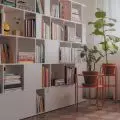
The new built-ins were accented with distinctive colors. In turn, their decorative character was broken with minimalist, hidden doors. Monolithic furniture, appearing in many rooms, emphasize the geometry of the space and the permeation of individual zones.
The cabinets are distinguished by intense colors
Photo: Grzegorz Layer
Layout for privacy
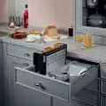
The largest room was adapted into a kitchen connected to the dining room and outdoor terrace. A centrally located, monolithic island and a row of cabinets hiding the entrance to the pantry organize this irregular, high space. The master bedroom with a closet is connected to the bathroom, creating a spacious and comfortable zone isolated from the rest of the apartment.
The bedroom is connected to the dressing room and bathroom
Photo: Grzegorz Layer
The new face of classics
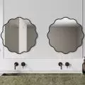
Natural, timeless materials were used in the interiors - wooden parquet flooring, stone in the kitchen and bathrooms, and natural veneer in two shades covering the furniture built-in. Italian terracotta appearing in several rooms gives the interiors a sunny, somewhat Mediterranean feel. Architect used antiques collected by the owners. Vintage lamps, furniture and accessories were highlighted by contrasting with modern, minimalist forms.
Stone was used in the bathroom
Photo: Grzegorz Layer
Are you decorating your apartment? We have more inspiration for you!
Compiled by:KATARZYNA SZOSTAK


