Interior - inspirations, arrangements, ideas
Timeless and in line with the latest trends decor. Subdued and economical, but far from monotony and boredom. Interior architect Malgorzata Gorska-Niwinska from MGN Architectural Studio reveals to us how she combined all these expectations of the owner in her design.
To avoid succumbing to boredom
Minimalist style seemingly simple in its arrangement can quickly become boring and devoid of individual character. In order not to fall into this trap, it is necessary to diversify all elements of the design the most, that is, materials, shapes, shades and textures. It is their richness that will replace the decorations, trinkets, ornamentation or fever of colors that minimalism rejects. In short, it will help get rid of the impression of unfriendly emptiness. We can complete our arrangement with some unusual shaped chair or mirror, or put some interesting floor lamp. Such additions will draw attention away from places where little is going on, the designer explains.
Choice of color scheme
A neutral palette is the prevailing color scheme when it comes to minimalism. However, it does not have to be monochromatic. You can juxtapose light shades with their dark counterparts (white and gray, as well as beige or brown) achieving a beautiful juxtaposition. A strong contrast will then be created, which will dynamize even the most simply decorated interior. It will also not be a mistake to add an accent in a bright color, such as honey. He will enliven the decor even more!
A variety of materials and textures diversifies the interior
© MGN Architectural Studio
Variety of materials
The richness of textures is undoubtedly the key to success here. When there are few and almost identical ones, the interior seems simply boring and empty. We can choose materials with different degrees of gloss or different textures. Heavily grained wood, rough concrete texture, lacquered boards are just a few of the ideas of how to differentiate a uniform interior with texture.
Balanced design
Małgorzata Gorska-Niwińska's advice is well illustrated by the design she prepared for this large apartment in downtown Warsaw. Economical, but interesting enough to become a model to follow for all admirers of minimalist interiors with class and strong character.
The minimalist living room is not devoid of character
© MGN Architectural Studio
Living area
The combination of the living room with the kitchen and the hall gives us a huge space of the living zone. Functional zones such as - dining room, kitchen, living room, hallway are clearly separated here and introduce spatial order. Thanks to the use of similar materials, they create a cohesive whole, which is both extremely exclusive and comfortable.
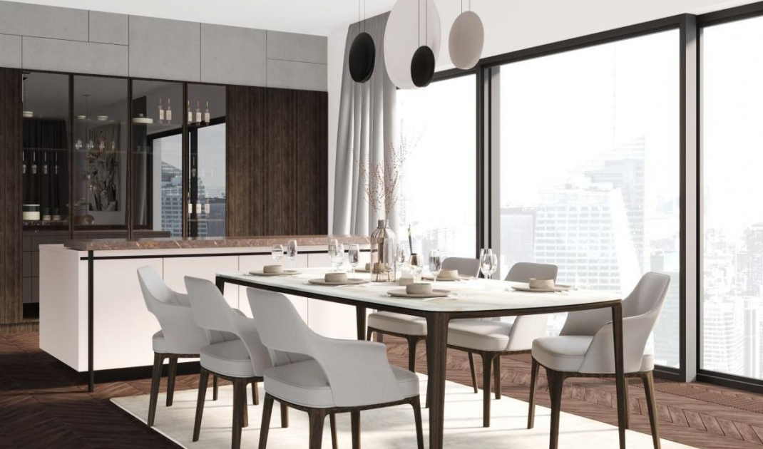
The dining room and kitchen are divided by an island with a marble bar. A section of the wall above the cabinets is also clad in marble. As you can see, it blends well with glass and wood - of which the kitchen space is made.
Directly next to the kitchen is the dining area. Interesting chairs and unusual oval-shaped lamps are elements that cannot be passed by indifferently in this arrangement.
A noteworthy solution is the placement of a large cabinet veneered with a distinct wood grain on the border of the open hall and the kitchenette. It covers up what is going on at the front door and, of course, provides storage space for clothes (access to which is from the hallway).
As for materials, around the TV space analogous to the kitchen there is marble used, as well as wood, or rather wooden fins with LED strips mounted between them - this soft light further diversifies the arrangement.
In the lounge area we can see beautiful tables in the shape of vases and an unusual lamp, fixed both to the floor and the ceiling, with multiple light sources in shades of different shapes. These shapes are impressive even when it's off!
A bedroom in calm tones is an ideal solution
© MGN Architectural Studio
Bedroom
With a darker color scheme in the bedroom, we get a more peaceful intimate atmosphere. It is not only functional, but also very decorative, although devoid of ornaments. In this interior, the original forms of the bedside cabinets and armchair are certainly the diversifying accents.
All elements of the designed bathroom are characterized by unusual lightness
© MGN Architectural Studio
Bathroom
At first glance, the striking stone on the wall catches the eye. The free-standing bathtub and sink and independent faucets add lightness and elegance to this interior. These appliances have such beautiful forms that they also have a decorative function in the interior.
The room is large enough to easily accommodate a huge shower cubicle, separated from the bathtub by a glass wall. Attention in it is attracted by a rain shower with an unusual shape, evoking associations with a lamp.
This is not an ordinary bathroom, but a luxurious bath salon. Such a character is given to this interior by the marble finish, the square footage, designer sanitary facilities and the bio-fireplace placed in the wall.


