Anna Wajda- Szczęsna of Wajda Studio was given a challenging task. The architect was to design a modern apartment that would at the same time fit in with the surrounding historic townhouses. The result? Check it out for yourself!
Apartment designed by Anna Wajda-Szczęsna
Photo: Natalia Mańczak
Climatic neighborhood
A modern multifamily building has been built near the Wildecki market, which perfectly fits in with the architecture of the neighborhood. As in the presented apartment, two worlds clash in it - minimalism and the style of tenement houses. The 35 sqm apartment was designed with the owner's visiting guests in mind.
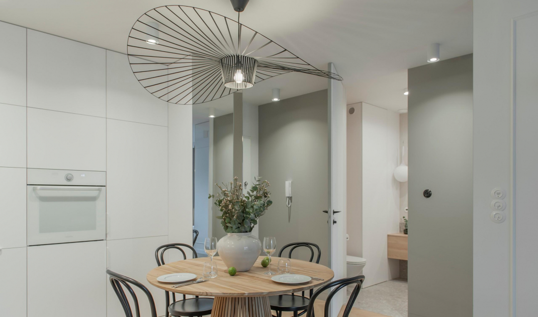
A table with chairs is the central point of the apartment
Photo: Natalia Manczak
Decorative living area
A complete contrast to the hallway is the living room connected to the kitchenette and dining room. There, detailing, wall stucco and a multitude of forms and textures take the lead. On the floor you will find wood laid in a French herringbone pattern in bleached oak. The architect redesigned the kitchen layout proposed by the developer. This resulted in two contrasting furniture units. One of them blends into the plane of the wall, while the other is an elegant piece of furniture highlighted with stucco and a remarkable mirror plinth. The use of a mirror makes the low kitchen unit appear to float above the floor. The focal point of the apartment is a round table, above which there is an original lamp. To create a contrast with the rest of the room decorated in light colors, the designer opted for black chairs. The living room, meanwhile, is a small space with a comfortable sofa and an RTV cabinet with an interesting form.
Rest area
Photo: Natalia Manczak
Intriguing juxtapositions in the bathroom
In the bathroom you will find a juxtaposition of two types of tiles. Base ones imitating stone, wrap from the floor all the way to the walls. Between these tiles, decorative tiles with an interesting striated texture and delicate veining of stone pass freely. The fluted tiles were also used as a strip of wall cladding in the kitchen.
Two types of tiles were used in the bathroom
Photo: Natalia Manczak
Bedroom full of contrasts
In the bedroom, due to limited space, the architect opted for bulit in white furniture, which serves as a background for the rest of the furniture. The black-painted steel bed frame was juxtaposed with an upholstered headrest in warm gray.
Upholstered headrest and furniture built-in in the bedroom
Photo by Natalia Manczak
Are you decorating your apartment? We have more inspiration for you! ClickHERE


