On the picturesque promontory of the Balearic Islands, two stylistic concepts meet — Mediterranean freedom and subdued Polish elegance. The interiors were arranged and decorated by Warsaw-based interior designer Dagmara Zawadzka.
Paradise surroundings
The apartment in Palma has an area of 115 sqm. Investors usually live in Warsaw, but thanks to remote work they are also able to spend time in the popular Balearic Islands. The apartment needed a metamorphosis. The owners dreamed of a large, bright space, filled with air and light, open to the sea and the sunny beach. The existing space, however, was dark and divided into smaller rooms by walls. The inconveniences of the layout were made up for by the wonderful view outside the windows. Waves hitting the shore, exotic greenery and tranquility. Dagmara Zawadzka noticed the advantages of this place already during the first meeting and proposed changes adapting the space to the clients' life. The architect started by demolishing all walls and combining the living room with the kitchen and dining room. The designer separated three rooms. She combined the owners' bedroom with a private bathroom and then planned two guest bedrooms and a bathroom.
The wallpaper behind the sofa refers to the nearby sea
Photo: Maria Miklaszewska Styling: Dagmara Zawadzka
Living room with sea view
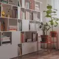
The hosts like to relax during movie screenings, so the living area had to include a comfortable sofa and a TV. Now they can share their passion with family and friends, because there is a lot of space on the corner sofa. It stands in the central part of the living room and a cinema area was planned opposite. The entire wall is filled with a bookshelf, into which the TV was integrated.
- I suggested to the clients that they should avoid stereotypical design. I didn't want the location to impose character on the interior. Here, on a sunny island, it was easy to decorate in a vacation atmosphere. However, I decided to break this rule — explains the designer.
In the living room there is a comfortable corner sofa, which is a place to watch movies
Photo: Maria Miklaszewska Styling: Dagmara Zawadzka
International mix
Dagmara Zawadzka proposed a mix of Polish and Mediterranean decor, so that the owners in sunny Mallorca would feel as if they were in their second home in Warsaw. Thus, the floor in the entire apartment was covered with dark-colored native oak and oak veneer with a nice wood grain was used as a finish for the bookcase. The ceiling is decorated, but also visually elevated, with classic stucco, and the lounge area is illuminated by a huge plafond. Mediterranean motifs complement polish accents. The wallpaper behind the sofa alludes to sea waves, and the white lacquered wooden slats, to the shutters popular in the south.
- This decorative element appears throughout the apartment. In addition to the fact that the laths add an interesting character, they also allow us to hide elements that we do not want to expose. For example, on such a lamella background I hung the TV, making it less visible, and at the entrance to the guest bathroom they hide the door. You can hardly see that they are there — explains Dagmara Zawadzka.
The TV has been integrated into the bookcase
Photo: Maria Miklaszewska Styling: Dagmara Zawadzka
The designer also made interesting use of the structural pillar in the living room. It could not be removed, because it supports the ceiling. So the architect decided to soften its form a bit. Previously an angular block, now has a rounded shape and is decorated with a mosaic referring in color to sand and sea foam. It also appears in the owners' private bathroom. The mosaic shimmers beautifully and gently illuminates the interior. As a result, the entire living room is very bright. Its extension is a huge terrace overlooking the bay, through which the sun peeks into the interior.
The structural pillar has been rounded and decorated with mosaics
Photo: Maria Miklaszewska Styling: Dagmara Zawadzka
In the glow of the sun and accessories
Through the use of an interesting procedure, more light was given to the private area. It is adjacent to the living room, so something like a window overlooking the living area was broken out of the bathroom area. It's a large pane of glass, which can be obscured to maintain an intimate character. Such a solution fantastically illuminates the interior. As do the gold finishes of the veneered cabinetry, jewel-toned sconces by the mirror and mosaic cubes that shine like grains of sand in the sunlight. Sophisticated faucets and bathroom accessories enrich the arrangement and add even more luxury.
The bathroom is decorated with a golden mosaic
Photo: Maria Miklaszewska Styling: Dagmara Zawadzka
The bedroom area also features subtle gold accessories. The color of bullion discreetly scrolls between the palm leaves on the wallpaper. Such a finish was also given to the handles of the closets and doors. The shiny elements are contrasted with dark veneers, Viennese plaid in the seats and natural fabrics.
In the arrangement of the bedroom gold intertwines with dark colors
Photo: Maria Miklaszewska Styling: Dagmara Zawadzka
Underwater world
The guest rooms have a more casual, Mediterranean atmosphere. This allows guests to feel like they are on a real vacation. The walls behind the bed headrests are decorated with wallpaper in floral motifs. There's a lot of white and light weaved furniture like the iconic Peacock armchair. The headrests of the beds are made of wood painted white. One of them also features an interesting decoration in the form of simple milling. The other one is decorated with fine piping.
The headrest of one of the beds is decorated with millings
Photo: Maria Miklaszewska Styling: Dagmara Zawadzka
The guest bathroom is shared by both rooms. It's full of corals, shells and sea grasses that wrap around the walls and front door. This melange of colors and patterns blends nicely with the geometric black-and-white mosaic on the floor. Everything is warmed by an elegant walnut-colored veneer.
The floor of the guest bathroom was tiled with black and white mosaic
Photo: Maria Miklaszewska Styling: Dagmara Zawadzka
Furnished with taste
Behind the lounge area, vis-a-vis the entrance to the owners' bedroom, the architect arranged a dining room. At the large table, which is reminiscent of the old art-deco „roundels”, Dagmara Zawadzka placed traditional chairs filled with Viennese rattan plaid. However, in order not to make it too heavy and serious, the whole thing was broken with a modern designer lamp. Behind the table, on the entire wall, suspended dressers were designed. They are crowned by a contemporary interpretation of the overhead in the form of hanging shelves. The mirrored wall beautifully reflects the entire interior and lets in even more glamour.
The dining room was arranged behind the lounge area
Photo: Maria Miklaszewska Styling: Dagmara Zawadzka
The dining area flows seamlessly into the kitchen. Kitchenette was hidden behind the wall. At first glance it is invisible, but it connects to the living room. The kitchen was arranged in a U-plan and decorated in shades of white, which is illuminated by gold details.
The white kitchen cabinets were complemented with gold details
Photo: Maria Miklaszewska Styling: Dagmara Zawadzka
Are you decorating your apartment? We have more inspiration for you!
Compiled by:KATARZYNA SZOSTAK


