A two-level apartment in the newest part of Warsaw's Żoliborz Artystyczny district has attracted the attention of investors with its prestigious location, the striking architecture of the building and the space of the interiors themselves. Barbara Godawska of iHomestudio is responsible for the interior design. The implementation, on the other hand, is the work of PRW Design.
Openwork staircase balustrade
Photo: Ola and Michał Przeździk-Buczkowski/ Budzik Studio
New division
The apartment in developer condition required extensive changes. It was not without demolition of all partition walls and thorough transformations in the layout of installations. Much craftsmanship was also required for the finishing touches.
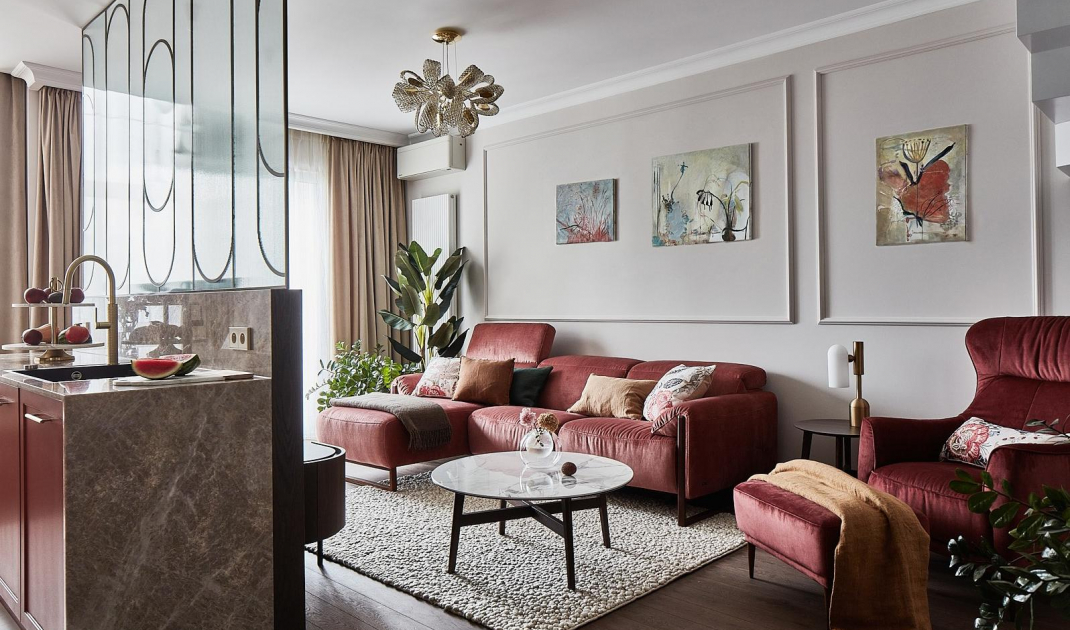
- A living room with a fully open kitchen was planned for the downstairs, while the investor wanted to visually separate the two zones. Hence the idea of an island with a glass screen. Besides, we decided to enlarge the kitchen space by the area of a small bathroom - recalls Barbara Godawska.
The living area is divided into a living room, kitchen and dining room
Photo: Ola and Michał Przeździk-Buczkowski/ Budzik Studio
A game of contrasts
Individually designed elements appear in the interior, including a distinctive metal and glass wall in the living room, a staircase balustrade with large sections of openwork, and a carpet staircase made unusually from a combination of two materials. Viewed from the living room, they are white, but from above - they show a wood finish.
Metal and glass wall in the living room
Photo: Ola and Michał Przeździk-Buczkowscy/ Budzik Studio
In the lounge area of the living room, natural oak flooring coated with pigment varnish was laid. A similar shade returns in the veneered wall of the island and the furniture also harmonizes with it. The desired contrast is introduced here by a soft bouclé carpet. This model is handwoven from New Zealand wool in a beige shade. To ensure that such a carefully composed color palette is not disturbed by the dark accent of the front door, its leaf was given a coating in a light shade similar to the color of the walls. The investor wanted accents of a more distinctive color to appear in the living area. Thus, against a neutral, sand-colored base appeared lounge furniture in a noble shade of dark red. The same color appears in the kitchen - on the fronts of the cabinets, which in the first version were to be beige.
The bouclé carpet brings a touch of coziness to the interior
Photo: Ola and Michał Przeździk-Buczkowski/ Budzik Studio
Harmonious mishmash
An accent of red enlivens the space, highlighting the delicate beauty of the hard and durable quartzite used for the kitchen island, the worktop and the panel on the wall above. A noteworthy element of the design is the spacious two-door side-by-side refrigerator in the built-in furniture, which connects to the upholstered seating in the hallway area on one side, and to the solid cabinet on the other. The architect easily combined wooden, brick and upholstered elements. At the same time, thanks to this treatment, the exceptionally large unit does not overwhelm the interior.
Upholstered seat in the hallway combines with the kitchen furniture
Photo: Ola and Michał Przeździk-Buczkowski/ Budzik Studio
Striking accents
The dining room is immersed in light coming in through a large-format, two-story high window. It is decorated with French and fleshy curtains. Because of the height of the windows and the weight of such hefty fabrics, the living room uses electrically powered rail curtain rods. It would have been virtually impossible to manually control the 5-meter high curtains, so automatic systems are the only functional solution here. The furniture chosen here continues the aesthetic of subtle elegance. The table has light ornamentation on the legs. The arrangement is complemented by upholstered chairs in a light beige shade and a striking, elaborate lamp with crystal shades.
Plenty of daylight flows into the dining room
Photo: Ola and Michal Przeździk-Buczkowski/ Budzik Studio
Are you decorating your apartment? We have more inspiration for you! ClickHERE
Compiled by:KATARZYNA SZOSTAK


