The shape of this apartment was unconventional. It imposed a lot of restrictions, especially since this time moving the walls was ruled out by the investor. In the end, architect Magdalena Daszkiewicz of PRZESTRZENIE studio designed an interior perfect for the apartment, functional and ergonomic.
The apartment has a non-obvious shape
Styling: Anna Salak Photo: Dariusz Jarząbek
Creativity and concept
The apartment has an area of 57 m2 and is located in Gdansk, Poland. The floor plan of this apartment is neither rectangular nor square. One might be tempted to liken it to a trapezoid, which causes the walls to meet at different angles. What's more, a major constraint was the lack of permission to remove or even move a wall. However, the architect decided to take advantage of this.
- The wall in the living area of this apartment is at a different angle than the main wall in the bedroom. We designed this interior so that all these curves cross in the corridor, and instead of hiding them - we used them as an asset. The result was a dynamic and boldly colored passageway, which we ourselves call a "tunnel." We wanted this solution to look minimalist, so we used, among other things, doors with hidden frames, no thresholds and handleless cabinets. And the proverbial "dot over the i" was to paint these elements in one and the same - strong color," says Magda Daszkiewicz, architect and owner of PRZESTRZENIE studio.
Salon
Styling: Anna Salak Photo: Dariusz Jarząbek
Hallway
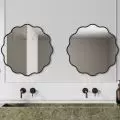
From the first steps, attention is drawn to the immensity of the details that create the character of this space and are a perfect complement to the insane view of the sea. After crossing the threshold of the apartment, we immediately come across a classic of Polish design - a mirror designed by Oskar Zięta. This is already a signal that people who love unique design live here.
Hallway
Styling: Anna Salak Photo: Dariusz Jarząbek
Living area
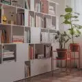
Just take a few steps further - to the living area, which combines three zones: kitchen, dining and lounge. There you will find another beautiful design forms that correspond perfectly with each other. Against their background, you can see many details such as vases, bowls and other ceramic objects.
Living area
Styling: Anna Salak Photo: Dariusz Jarząbek
Kitchen
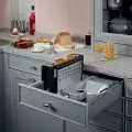
The countertop uses stone with a strong speckled pattern. The pattern goes from the countertop to the wall, which is covered with paint that gives the effect of clay plaster. The architect admits that she searched for such for a long time, because most so-called textured paints give an artificial, glossy, stucco-like effect, which absolutely did not fit this interior.
Kitchen
Styling: Anna Salak Photo: Dariusz Jarząbek
Bedroom
The apartment also has a small bedroom with built-in furniture, the color of which blends with that used in the hallway. The wooden headrest of the bed also perfectly matches the color of the wall and the element that emphasizes the character of this space is the dangling lighting, whose wires are routed along the wall in imitation of industrial interiors.
Bedroom
Styling: Anna Salak Photo: Dariusz Jarząbek
Bathroom
There is another room in this apartment that you can't pass by indifferently. The bathroom with black in the lead role. The fact that it is so spacious is due to the fact that the washing machine and dryer are located in the built-in - in the corridor, so here Magda Daszkiewicz focused on creating a bath room - with a large shower area.
Bathroom
Styling: Anna Salak Fot. Dariusz Jarząbek
Are you decorating your apartment? We have more inspiration for you! Click HERE
Design: KATARZYNA SZOSTAK


