The apartment designed by Grzegorz Kłoda of GK- Atelier belongs to a Polish family with two children, who live in Norway. The investors have been working and living in the country for years and sincerely love it. They especially appreciate Norwegian nature, especially during winter.
The arrangement of the apartment was supposed to be minimalist, but cozy
© GK-Atelier
A substitute for the northern landscape
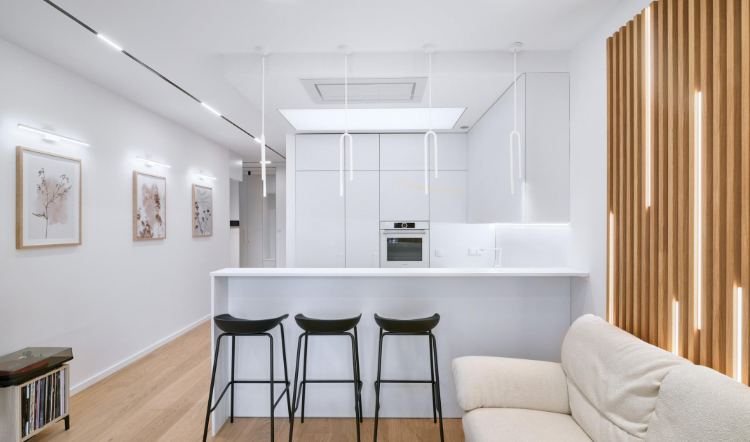
The apartment, located in Lublin, is used by the investors during their trips to Poland. The interior was supposed to be very bright with lots of lighting. However, the investors categorically did not want chandeliers. The family wanted the arrangement to be minimalist, but not too sterile. The apartment had to have a cozy home-like atmosphere. The color palette is based on earth and snow colors, from white to black, and complemented by elements of light, fresh-cut wood.
Plan of the apartment
© GK-Atelier
Fresh colors
The apartment's living space is dominated by white color and oak wood. A large amount of diverse lighting makes it possible to model the climate of the interior, adjusting it to the mood and the occasion. The whole arrangment is sprinkled with elements of beige in the form of a sofa and curtains, as well as a table and a rug introducing an earthiness. Traces of black can be found in details such as hockers and track lighting.
The arrangement is dominated by a combination of white and light wood
© GK-Atelier
Like in a Norwegian forest
An interesting element is the decoration behind the sofa in the living room. As an inspiration for it, the investors presented a photo of a snowy forest, in which the rays of the setting sun pierce through the rhythmically growing trees. These wooden vertical laths interspersed with LED lighting are a metaphor for this image.
The decoration behind the sofa alludes to the Norwegian forest
© GK-Atelier
In good light
In the kitchen, as in the bathroom, the main goal was to achieve maximum functionality. White stretch ceilings were used in both areas. These diffuse light and mimic the sun's rays. The entire kitchen design was also kept in a combination of white and light wood. As a result, the arrangement is consistent and the kitchenette gently transitions into the living area.
A stretch ceiling was installed in the kitchen
© GK-Atelier
Natural references
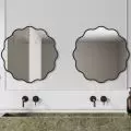
The bathroom arrangement is dominated by earthy colors, gray and black details. On the walls you will find microcement, which investors appreciate for its practicality, texture and minimalistic appearance. This material was used as a reference to natural stones.
The walls of the bathroom were covered with microcement
© GK-Atelier
Are you decorating your apartment? We have more inspiration for you!
Compiled by:KATARZYNA SZOSTAK


