We have already previously presented the three-level children's room, bedroom and three bathrooms , as well as the living room, cinema room and garage of the house designed by Jan Sekuła of Zarysy studio. Today we take a look at the final part of this project - the kitchen with dining room and circulation areas.
Turning to nature
When designing the house, Jan Sekuła focused on the nature that surrounds it. Due to the large glazing, it can even be said to "enter" its interior. The subdued earth colors used in this arrangement harmonize perfectly with the proximity of the garden and the lake. The house has a very modern character. There are a lot of minimalist solutions in it. At the same time, thanks to the use of a lot of wood and original details, it is an extremely cozy place. A lot of natural light, makes that the dark colors chosen for the interiors do not overwhelm the rooms, but give them a warm atmosphere.
The design is inspired by nature
Photo: Tomo Yarmush
Hallway with a mountain theme
The entrance area is a bright and spacious extension of the living room and dining room. The main idea when designing the hallway, was to expose the block of stairs. This was achieved by encasing most of the hallway in wood, which gave it a minimalist feel from the entrance. In addition, the materials used in the hallway, such as terazzo tiles, relate to the rest of the house. Large glazing exposes the garage in a modern way. A graphic with a simple mountain motif perfectly fits in with the atmosphere of nature and foreshadows the rest of the arrangement. A large, comfortable pouffe makes daily dressing easier. Storage space has been hidden in the wooden walls, which keeps things tidy. A round, simple dog bed has been placed under the stairs.
The hallway features wallpaper with a mountain theme
Photo credit: Tomo Yarmush
Meeting place
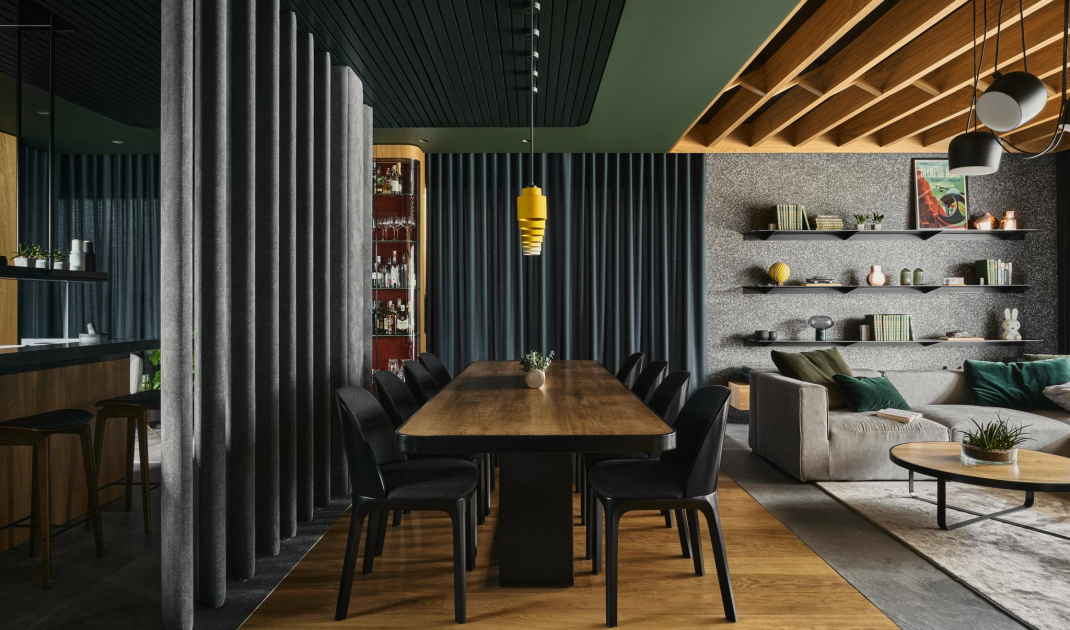
The dining room features a large steel-framed table that seats up to 10 people. It is complemented by minimalist chairs. Simple pendant lights highlight the warm wood of the tabletop. The dining room was separated from the kitchen by a felt partition. Such a solution is not only impressive, but also has its practical use. Thanks to it, it was possible to hide the supporting pillar, while keeping as much space as possible. The texture of the felt gives both rooms softness and coziness, combining perfectly with the stone elements of the kitchen and the wood on the dining room floor.
The dining room was separated from the kitchen by a felt divider
Photo: Tomo Yarmush
Minimalist kitchen in alpine style
From the dining room we seamlessly transition to the kitchen. To maintain a somewhat austere character, instead of smooth veneer, the designer used wood in the form of planks. This allowed the kitchen to maintain a modern and simple form, while receiving texture as a varied detail. The warm wood harmonizes perfectly with the muted green and shades of gray. Smooth colors were broken with a multitude of textures and elements such as stone, terrazzo and felt. Each of them has a "spotted form" maintained in similar colors. In the kitchen building are hidden all the necessary equipment and storage space. Cooking is facilitated by a large countertop and an island, which additionally serves as a bar.
Kitchen in the color of warm wood
Photo: Tomo Yarmush
A corner for relaxation
Right next to the kitchen, a place to catch a breath with a beautiful view of the garden was created. There are comfortable armchairs and a modern glass display case with a rounded shape, which displays the collection of liquor. The noble dark burgundy color of the bar's interior refers to the round simple table.
A corner overlooking the garden
Photo: Tomo Yarmush
Staircase and corridor on the first floor
The super-modern body and minimalist wooden beams are arranged in such a way that they appear to be suspended in the air, making the whole thing look very light. They lead to the upper corridor. Here the designer opted for simplicity. The combination of the two colors of wood and the rounded edges on the shelves and ceiling, referring to the lower part of the house, give this place a unique character. The shelves are the perfect place for family photos, mementos or books, which will be further exposed by led backlighting.
Upper hallway
Photo: Tomo Yarmush
Are you decorating your apartment? We have more inspiration for you! ClickHERE
Compiled by:KATARZYNA SZOSTAK


