The starting point for the arrangement was a velour sofa in a blue-green shade, brought from a previous investor's apartment.
The open-plan living area consists of a kitchen, dining room and living room
Photo by Dagmara Maroszek-Bździuch/MUFKA FOTOGRAFIA © PEKA
Gentle transition
Half of a semi-detached house in a Poznań housingestate is where a married couple with two children live. The investors wanted their dream interior to be bright, spacious and minimalist, but cozy at the same time. They asked interior designer Danuta Bernat, owner of KREA STUDIO, for help. The architect took care of the functional and aesthetic sphere of the living space.
- When the living room, dining area and kitchen are a whole, the architect's task is to combine this in such a way that colors and textures work together. Hence the idea that the kitchen should relate to the living room, or more precisely its color accent, the sofa - says the designer.
The eucalyptus sofa was the inspiration for the rest of the interior
Photo by Dagmara Maroszek-Bździuch/MUFKA FOTOGRAFIA © PEKA
In the colors of eucalyptus
The kitchenette was to have a distinct, but not overwhelming color. This is because the color was to combine the green beloved by investors with the graphite of the built ins. This is how the eucalyptus kitchen was created. In the strip under the window, the designer created a long row of kitchen cabinets to accommodate all the necessary accessories and food supplies. To make full use of the capacity of the lower development, special systems were used in the cabinets to facilitate organization. This helped to accommodate everything without having to install wall cabinets. Such a solution made blending the kitchen into the living room possible, perfectly connecting the two.
Eucalyptus fronts combine beautifully with the graphite of the development
Photo by Dagmara Maroszek-Bździuch/MUFKA FOTOGRAFIA © PEKA
Ergonomic and stylish
- Each kitchen is a different story, we struggle with the square footage, the existing connections, the possibilities for changes, the established budget, verification of the ideas we collected as inspiration. However, the most important task when designing a kitchen open to the living room is to harmonize function with aesthetics - says the designer.
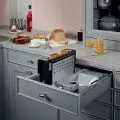
One of the most difficult and longest-discussed aspects of kitchen organization was the design and arrangement of cabinets. Preserving the ergonomic sequence and the owners' habits had to be reconciled with the new design and size of the kitchen. Here practical corner and cargo systems came to the rescue. With pull-out shelves located in the corner, everything is within easy reach. On the other hand, the streamlined shape of the shelves allows for optimal placement of round and oval dishes such as pots and pans on their surface. A cargo compartment has been placed right next to the cooktop. It created an ideal place for storing such products as spices, oils, etc.
The cabinets have been equipped with systems for easy storage
Photo by Dagmara Maroszek-Bździuch/MUFKA FOTOGRAFIA © PEKA
Storage under control
The buckle connecting the living room and kitchen areas is a wooden floor laid in a French herringbone pattern. Its light color harmonizes with the round dining table and chairs. The conventional boundary of the living room, meanwhile, is a comfortable sofa and armchair. A white built-in cabinet extends under the TV set. Behind the gray wall panel, the designer hid the necessary wiring. The furniture, both in the kitchen and in the living room, was created according to Danuta Bernat's design. This makes it easier to maintain order in the apartment, as all small items have their place in capacious cabinets.
Under the TV there is a large white cabinet
Photo by Dagmara Maroszek-Bździuch/MUFKA FOTOGRAFIA © PEKA
Are you decorating your apartment? We have more inspiration for you!
Compiled by:KATARZYNA SZOSTAK


