At the very beginning, the investors had only planned to refresh the living room and bedroom, redo the bathroom and improve the children's rooms on their own. However, after several discussions with Magdalena Gackowska from the Gackowska Design studio, they decided to do a general renovation. As a result, the entire apartment received a uniform, consistent color scheme, and the space became functional, bright and no longer in need of further improvements.
Major changes
Laminate panels were removed from the floor. The arches located in the passageways were leveled to right angles. The floor tiles in the kitchen and bathrooms were left unchanged, as there is underfloor heating under them. Throughout the apartment, the floor was leveled and vinyl panels were laid. Also on the tiles with heating. All walls are the same light gray color. Only in the daughters' rooms a little pastel colors were added. All built-ins are consistent in color. The lacquered MDF fronts are the same shade as the laminated boards. The entire electrical system was also replaced, as the previous one was not in good condition. This added new lighting points and brightened up the interior.
Living room
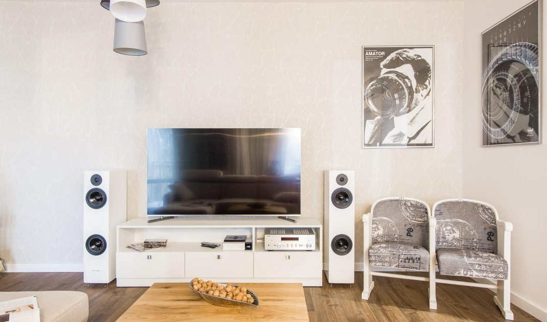
Before the renovation, books were stacked in a cramped hallway. Now they found their place in an architect-designed two-color and partially enclosed bookcase that filled an alcove. This also made it possible to set up a piano. An important part of the arrangement is the cinema corner. The owner mentioned his passion for movies. That's why cinema chairs and original movie posters appeared in the interior.
Living room
© Gackowska Design
Kitchen and dining room
In the center of the kitchen is a table, which comes in handy for daily meals. The table and coffee table are exactly the same style and made of the same materials. The wall cabinet hides the chimney and hood, while oak shelves house the wall arrangement. The oak countertop does require more care, but the owners were prepared for it, and the countertop with its naturalness adds warmth to the interior. On the wall with the dining room Magdalena Gackowska designed a high built-in. Apart from it, only under-counter cabinets were added. Both the dining room and living room are illuminated with additional, stronger lighting, technical lamps and LED tape hidden behind a blind. During the day, the windows provide a lot of light, while in the evenings, thanks to curtains and drapes, the wall creates a unified, cozy whole.
Dining room and kitchen
© Gackowska Design
Bedroom
Previously completely uncomfortable, with a bed added to the wall and a non-functional closet. The project involved making a built-in combined with the bed. This provided a separate space for clothes and a comfortable sleeping area. The bed was shortened by a headrest, and upholstered panels were pasted on the wall in its place. A free space was created by the window for a mini desk, which came in handy for later remote work.
Bedroom
© Gackowska Design
Children's rooms
The wall of the children's room was moved by 20 cm. After these subtle changes, there was room to set up a comfortable closet and a comfortable entrance to the other room. The girls got more space, comfortable beds, desks and space for themselves. The fireplace and the closet in the daughter's room, the owner repainted on his own. An exercise ladder also fit in one of them. The rooms are kept in a uniform, bright color scheme. The closet in one of them was also repainted white. A pastel blue-mint wall and colorful pillows were added. The interior is light, girly and comfortable.
Children's room
© Gackowska Design
Toilet
In the original layout, the developer envisioned an uncomfortably small toilet and bathroom. The investors gave up the toilet in favor of a large bathroom. It was therefore possible to use plumbing connections to restore the toilet, however in a more comfortable version. In the toilet, you will find a built-ins made of lacquered MDF board and a mini sink. The walls are lined with hexagonal tiles.
Toilet
© Gackowska Design
Bathroom
The bathroom was designed with space for a washing machine and dryer, which were built in and hidden by the door. Space was gained by installing a semi-countertop sink. The enclosure underneath it allows to hide cosmetics, while it is shallower than with standard washbasins. It is worth noting the tiles located on the rack and bathtub development. This is because a vinyl panel was laid on the floor. So the designer chose tiles that perfectly match it.
Bathroom
© Gackowska Design
Are you decorating your apartment? We have more inspiration for you! Click HERE


