We have already previously looked at the living area and children's rooms of an apartment in Warsaw's Żoliborz Artystyczny district. Today we present a guest bathroom designed by Barbara Godawska of iHome Studio. PRW Design is responsible for its implementation.
Classic elegance
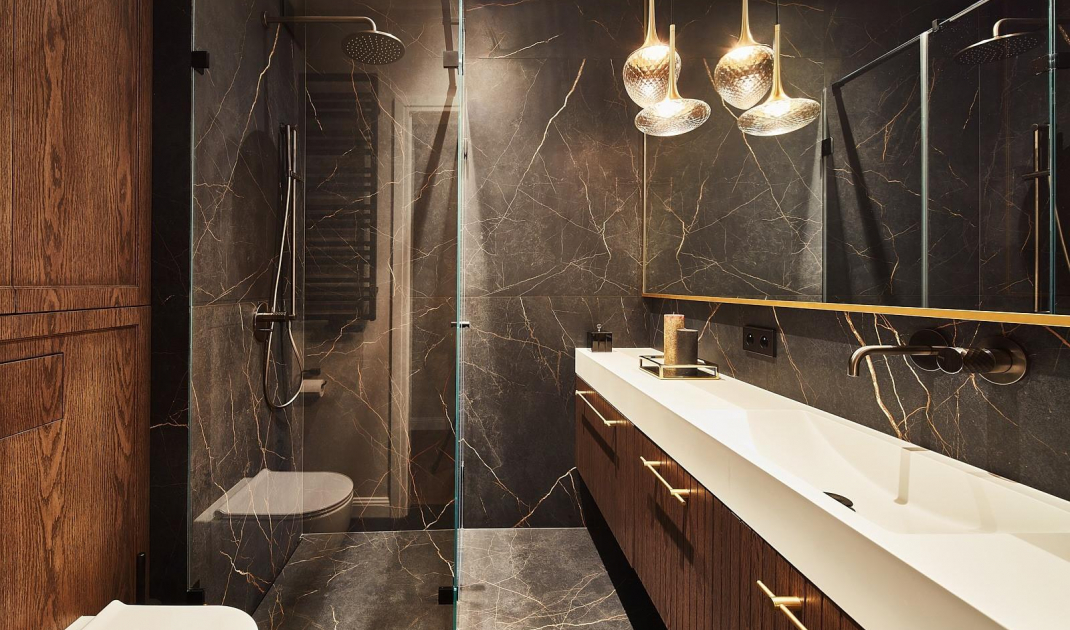
Guest bathroom is dominated by dark colors. Brown, black and additions of white with gold dominate this interior. That combination creates a classic, timeless and elegant arrangment. Two materials were mainly used here: large-format tiles and elegant veneer. The former covers the walls and floor of most of the room, including the shower area. The veneer, on the other hand, was used in the toilet area and in the built-in furniture.
The flat toilet button blends with the wall
Photo: Ola and Michał Przeździk-Buczkowscy/ Budzik Studio
Glamorous lighting
Lighting also plays a very important role here. In addition to simple white fixtures, you will also find lamps that are a real ornament of the bathroom. A set consisting of two lamps with a classic shape and two with a flattened shade, sets the tone for the entire arrangement and makes it unique. Thanks to the location of the lighting in close proximity to the large mirror, its sheet beautifully reflects the light and optically enlarges the space.
The lamps are a real decoration of this interior
Photo: Ola and Michal Przeździk-Buczkowscy/ Budzik Studio
Attention to every detail
The element that shows with what attention to every detail this arrangement was created is the shower. Very simple and minimalist, it consists only of glass walls and a faucet with a rain shower. As a result, the small space of the bathroom does not seem overwhelmed. It is worth noting the linear drain, which, due to its location against the wall and extremely careful workmanship, is almost invisible. The design of the toilet buttons is also interesting. Instead of typical protruding models, flat ones have been used here. They are flush with the wall and finished just like it.
The linear drain is almost invisible
Photo: Ola and Michał Przeździk-Buczkowscy/ Budzik Studio
Are you decorating your apartment? Check out our bathroom design tips
Compiled by:KATARZYNA SZOSTAK


