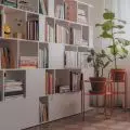
Simplicity, light blue combined with gray and, above all, betting on minimalism. The arrangement shows how to create a great space in a small area in an interesting way.
The arrangement of the kitchenette was mainly based on a uniform development and hiding household appliances.
© Decoroom
The apartment on Solidarności Avenue, Warsaw that we will present today is an interesting example of a property rented directly by a developer. It's a fledgling business model that involves building a property ultimately for rent. The apartment designed by Decoroom studios is an example of such an implementation.
Minimalism was the idea that guided the designers
© Decoroom
The design of an apartment for rent must take into account both practical qualities and their decorative and visual form. A well-thought-out concept of each room is very important, so that the materials used in it harmonize with the function it is to serve in the process of use. However, we can't forget about coherence - the whole must harmonize with each other, so that it is functional and at the same time attractive to the eye," says Agata Mika, Decoroom interior designer, responsible for the interior design at Solidarności Avenue.
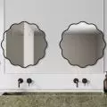
The bathroom is also a space based on simplicity
© Decoroom
living room with kitchenette
The living room and its furnishings have been kept in a palette of gray, white and light blue. New colorful accessories such as an orange armchair are visible in several places. The furnishings are characterized by their minimalist nature. The furniture refers to the classics of Scandinavian design. In the kitchen development, it was important to properly hide household appliances, so that together they form a unified Simplicity was the main goal of the designers, which is evident as much in the kitchen as in the living room. The purpose of this space is primarily to calm and harmonize.
The living room is directly connected to the kitchenette
© Decoroom
bedroom or two colors
The bedroom is the space in this realization that completely knocks out the aesthetic differentiation. Behind the corner of the bed, the color scheme literally cuts in half. Part of it is solid orange, part is gray with imitation concrete. Next to the bed were two simple black bedside tables.
The bedroom is a space dominated by two colors
© Decoroom


