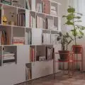
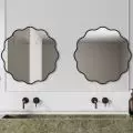
Homeowners are increasingly choosing to change the functional layout. Some do it out of necessity, but more and more often we want to adjust the home space to our own needs. For the clients of Sobkowiak Architektura office, it was important to change the functional layout.
The living room is dominated by gray, with turquoise standing out in the background
© Sobkowiak Architektura
dividing into parts
The apartment in Warsaw's Praga district was occupied by a couple of young people who set out to completely change their apartment. The apartment was originally divided into a living room with a kitchenette, two bedrooms, a bathroom, a toilet and a very large corridor and entrance hall. The communication zone took up about thirty percent of the total area, which meant that the interior lacked functionality.
The kitchen in this case is the heart of the house
© Sobkowiak Architektura
For the clients, it was important to minimize the lobby and enlarge several rooms. First of all, the developer envisioned a small kitchenette connected to the living room in the apartment. For the investors, the kitchen was a priority, as they like to cook in their free time. One of the rooms was allocated for a kitchen, and the demolition created a spacious open living area.
In favor of a corridor, the bedrooms were also increased, with a dressing room and a guest toilet. The goal was to redesign the space to make the most of the space.
In the bedroom you will find more blue
© Sobkowiak Architecture
re-furnishing
For the flooring, a herringbone parquet floor was chosen, consistently kept in a darker color scheme. The furniture was finished in American walnut veneer. The same color scheme was juxtaposed in the kitchen, bedroom and living room.
The furniture was solved in an interesting way - the investors with the designer decided on a variety of colors, some of the furniture is white, gray and some is turquoise or striking tones of green marble.
From the living room you can perfectly see how the lobby has changed
© Sobkowiak Architecture


