The 60 m² apartment belongs to a couple of investors who dreamed of living in a place with history. The interior of this unusual space was designed by Marta Iglewska and Radosław Wójcik, architects from the Interiorsy studio.
Design challenge
The investors wanted their place on earth to be unique. They decided to get an apartment in an old wooden building in one of the housing estates in Otwock. However, the interior needed extensive renovation.
- The condition of the interior differed significantly from what the real estate agent had offered and the apartment needed much more extensive renovation than the initial inspection had indicated. The bathroom was in the worst condition. Gently refreshed, it meticulously hid mold and mildew resulting from outdated installations — says architect Marta Iglewska of the Interiorsy studio.
The apartment has a lot of vintage elements
Photo: Interiorsy
A real home
Despite the adversities, the architects created an interior perfectly suited to the investors' needs. What's more, they also managed to arrange a psychotherapy office here, where the investor meets with patients. The owners' pet, the dog Florcia, also feels good here.
lets to pet
- Florcia was taken from a shelter and kept distance from everyone for a very long time, even in the old apartment. When we moved to the new apartment and changed the environment Florcia finally let people to pet her and even started to sit on lap... even of strangers! — Marta Iglewska recalls.
There is also a dog living in the apartment
Photo: Interiorsy
Space with character
The open living area isn't large. However, it was possible to divide it into clearly delineated zones, the symbolic border of which is marked by a stylish fireplace. The wall behind it is covered with traditional tiles with an arabesque pattern. They not only look beautiful, but also protect the space around the fireplace. Opposite it stood an equally ancient wooden table with a decorative top in hexagons pattern. Together with richly carved chairs, it creates a cozy dining space.
The fireplace stands against a background of decorative tiles
Photo: Interiorsy
Items with history
The interior is filled with gems meticulously searched for at the flea market. The architects created a subtle background for them.
- Subdued colors allowed us to emphasize the presence of objects so diligently collected by investors, while maintaining the authenticity of the interiors. Here, every detail matters. It is not only close to the hearts of the owners, but also tells its own story. This is particularly evident in the living area, which is a kind of display of gems collected over the years — adds architect Radosław Wójcik.
A table with a decorative top and ornate chairs make up the dining area
Photo: Interiorsy
Evening with a book
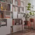
The living room area is a place for relaxation. However, it lacks space for a TV set. Entertainment for the owners is provided by reading their favorite books. They have been exposed on the numerous shelves of the development located on the wall with the window. There is also an old Viennese-style rocking chair and a cozy sofa. Such an arrangement creates an ideal reading corner.
The wall with the window has been allocated for a bookcase
Photo: Interiorsy
Juicy kitchen
The kitchen decor, on the other hand, is the complete opposite. Here the architects used a varied palette of greens. Beautiful mint color apperas on built-ins. It is complemented by gold handles. Green wallpaper decorates the work zone with a motif of lush, exotic plants. It was laid only on one of the walls, so it acts as a vivid background for the whole arrangement.
The space above the countertop was decorated with a wallpaper with a botanical pattern
Photo: Interiorsy
Two worlds
The bedroom space combines both of these arrangements. The interior is subdued, but it has vivid accents as well. Whites and grays were juxtaposed with navy blue. The fronts of the wardrobe have been visually divided into two strips of color. At the same time, they seamlessly connect with the headrest of the bed, optically expanding the small space.
The arrangement of the bedroom combines a subdued base with vivid accents
Photo: Interiorsy
Are you decorating your apartment? We have more inspiration for you!
Compiled by:KATARZYNA SZOSTAK


