Hanna Pietras and Joanna Poradowska designed an apartment for a pair of doctors. The interior is located in a tenement house in Łódź from 1913.
The arrangement is an eclectic mix of modernity with vintage elements
Photo: Mood Authors
A place with soul
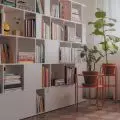
The 75 m² apartment has been in the owner's family for years. The interior was passed from generation to generation along with all its furnishings — lighting, furniture, ceramics. As a result, the space was filled with things with a history. It was almost like a warehouse of antiques which correspond perfectly with present day.
- It's not often that we design an interior based on furniture, but in this case, we couldn't imagine otherwise. On site we found real design classics, many vintage gems. Some furniture needed refreshing, renovation. A blue sideboard from the 1950s, Thonet chairs with rattan netting and many other items were undergoing renovation at the Piwnica gallery in Łódź- says Hanna Pietras.
The architects managed to preserve the original parquet floor
Photo: Mood Authors
Balance between past and present
In order to prevent the place from becoming a museum with family heirlooms, the designers from Hanna Pietras Architects studio added many modern elements to the interior. For example, above the kitchen table, there are straw hats brought by investors from China. The massive desk is decorated with a Kaiser Idell 6556 lamp designed by Fritz Hansen. The interiors are dominated by shades of brown and red. As a result, even the contemporary pieces blend well with the vintage furniture. It was possible to preserve the original parquet floor, which got renovated. Window sills were designed to match it.
Vintage furniture is complemented by modern elements
Photo: Mood Authors
Unobvious combinations
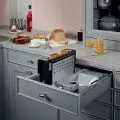
The kitchen was originally located in a different place. However, it was brought closer to the living room, so now it is only partially separated from the lounge area. This is what the owners were particularly keen on. In addition to the open passage, a vertical window was designed between these rooms. Thanks to this, when standing at the sink, you can look into the room. At the same time, the glass limits the penetration of odors.
- The rounded corner and fluted fronts of the kitchen cabinet form a coherent whole with the furniture, which is located in the hallway. This shows how wrong it is to think that eclecticism is a collection of mismatched furniture and accessories. Eclecticism is the art of combining, of looking for consistency out of the ordinary. I sometimes call it controlled chaos — says Hanna Pietras.
The kitchen is separated from the lounge area by a vertical window
Photo: Mood Authors
Design challenges
Decorating a tenement apartment requires a lot of creativity. Originally there was a bathtub in the bathroom, which meant there was no more room for a sink. The designers cleverly used every centimeter, so they managed to equip this room with both a smaller bathtub and a sink, as well as a lot of storage space. The apartment is more than 4 meters high. So the architects decided to keep the already existing mezzanine. The space above the corridor and the adjacent study includes a sleeping area for visiting guests. Also worth noting is the corridor lined with corsets.
The corridor was decorated with corsets
Photo: Mood Authors
Are you decorating your apartment? We have more inspiration for you!
Compiled by:KATARZYNA SZOSTAK


