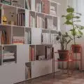
TheScandi interior designed by Kres Architekci studio was created for a married couple with two pets: a cat and a dog. The apartment of nearly 80 sqm consists of a bedroom, a guest room, a bathroom, a toilet, a dressing room and an open living space: a hall, a kitchen and a living room with a dining room. The development is located in Warsaw's Mokotów district.
Daily zone
Photo: Ewelina Ozdoba, Ewa Kaplarczyk
The layout of the apartment required correction. Designers Ewelina Ozdoba, Daria Asadchaya and Agnieszka Wnukowicz proposed demolishing the partition walls of the originally closed kitchen and separating the dressing room, which is also the characteristic central point of the entire apartment. With the demolition, however, there was the challenge of the plumbing closet, located centrally, at the very entrance to the living room and kitchen area. The idea for this element was to cover it with planes of mirrors combined with black metal muntins and merge it with the island. This procedure made the originally problematic form, gain a new quality. Becoming a decorative element, the mirror-covered walkway reflects light and visually enlarges the space, providing a background for the daily life going on in the apartment.
Kitchen
Photo: Ewelina Ozdoba, Ewa Kaplarczyk
- The main idea was to maximize the use of the existing space so that it was both aesthetically pleasing to the minimalist style that the investors appreciate, and practical for everyday functioning. Since the investors' passion is traveling, we wanted to create a place where one can calm down and relax. At the same time, we wanted to maintain functionality for the sake of the animals," says Ewelina Ozdoba.
Dining room
Photo: Ewelina Ozdoba, Ewa Kaplarczyk
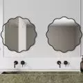
To balance the strong, linear forms of the various elements of the interior, they were juxtaposed with organic elements. They perfectly complement each other and add a touch of Mid-Century Modern style to the space. The rounded corners of the wooden built-in closet are an element that was created already at the stage of planning the functional layout. The mirror in the hall, the hanging console located at the entrance and the coffee tables also took an organic form. The whole is complemented by elements from the world of art, such as a large spatial painting in the dining room. It complements the interior and gives it a more unusual dimension. The designers wanted to combine modernist, strong solids with soft and rounded forms.
Hall
Photo: Ewelina Ozdoba, Ewa Kaplarczyk
A soft sofa, covered with fabric in a shade of warm, broken gray, perfectly matched this space. The form of the sofa is cubist, strong, also in the Mid- Century Modern trend.
-The arrangement of the space uses natural colors and fabrics in neutral colors. The honey shade of the wooden furniture was combined with shades of gray on the terazzo tile and wooden floor. The bathroom, meanwhile, features additional deep-textured tile, highlighted by specially designed lighting to give it a spacious feel. Structures are another of the key elements in building the atmosphere of this interior. All the corrugations, laths, textures and fabrics used, add quality to the space, as well as interesting details, highlighted by chiaroscuro," the designer describes.
Table and sofa in the living area
Photo: Ewelina Ozdoba, Ewa Kaplarczyk
The Scandi project also features high-quality materials, such as veneered built-in units with hidden doors and slats, milled fronts in wall cabinets, and a unique island with an overhang on the living room side, designed and constructed for this project. The island was a design challenge because of the many functions it accommodates inside. Thanks to the design of the overhang, investors are able to take full advantage of the worktop, with hidden lighting illuminating the worktop directly. Above the island, less technical, decorative lighting was also used in the form of irregularly shaped pendant lamps. All the furniture built-ins were made to size with the utmost precision, which allowed the space to be used 100%.
Bathroom
Photo: Ewelina Ozdoba, Ewa Kaplarczyk
An interesting treatment is also the use of minimalist linear lighting in the kitchen and hall, which in a way directs to the living area.
- The investors from the beginning had a vision of what their apartment should look like, and we as designers combined their requirements, functionality and the latest trends into a whole, which allowed us to create a space that is both aesthetically pleasing and incredibly functional. A big applause is also due to the investors, for attending to every detail of the implementation and the amount of commitment they put into realizing their dream space," Ewelina Ozdoba emphasizes.
Are you decorating your apartment? We have more inspiration for you! Click HERE


