The interior designed by Hanna Pietras combines a subdued color base with a play on materials and structures. Glazing and unique shapes of furniture give the minimalist space a unique character.
Two levels and different heights
The main idea of this project was to create a comfortable and spacious living and sleeping area. The space that Hanna Pietras and her team designed, however, hid several drawbacks. The original layout was not very functional. In addition, the interiors had different heights. At the highest point it was more than 2.60 meters, and the difference between rooms reached up to more than 20 cm! This made the space feel jagged.
- The apartment with a terrace is almost 110 sq m, so in theory this meant that the space had unlimited possibilities. Theoretically. We had to work with different heights and adjust the functional layout of the rooms just for them. Ultimately, the interior didn't lose out on this. It introduced a certain dynamism into the space, says Hanna Pietras.
Island in the kitchen
Photo: FOLLOW THE FLOW
Subdued colors with a touch of madness
The owners wanted to live in a modern interior with a claw. They wanted something in the design that would make this interior just theirs. The architect suggested a subdued color scheme combined with a wealth of materials.
- We chose a base of three colors and built the entire interior around them. This makes the space calm, harmonious and consistent. We used a mix of natural materials. And this "claw", which the owners wanted, we smuggled in details that built the character of this interior. This includes the wallpaper in the bedroom, or the glazing in the kitchen," adds the architect.
Decorations
Photo: FOLLOW THE FLOW
Kitchen and dining room
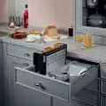
The main role in the kitchen is played by a large island, which is distinguished by its multifunctionality and rounded form. Its smooth wooden finish corresponds with the cabinets. The kitchen furniture is distinguished by decorative, fluted fronts. A strong accent, or rather the aforementioned "claw" is their color - deep black, which against the background of white and gray catches the eye. A step further we have the dining area with a round table on a tapered leg. Right next to it stands a chest of drawers, the fronts of which perfectly match those on the cabinets in the kitchen.
Kitchen and dining room
Photo by FOLLOW THE FLOW
Living room
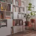
The living room is consistent with the rest of the living area thanks to the color scheme used. Here, too, you'll find muted gray and natural materials such as wood. The owners pay a lot of attention to accessories - pillows, vases and other decorative elements.
- One of the inspirations was Portuguese minimalism, in which we find a lot of materials and textures. In this style we play with texture and shade, rather than strong color separations. That's why there are a lot of accessories in this interior. They perfectly match the base. They build up this interior," says Hanna Pietras.
Living room
Photo: FOLLOW THE FLOW
Children's room
So let's go upstairs. Into the private area - the bedroom. The children's room stands out in color. However, no stiff blue or pink was used here. The room is filled with green with a touch of blue. The beautiful, fresh shade is the base for bright furniture and patterned wallpaper.
Children's room
Photo by FOLLOW THE FLOW
Bedroom
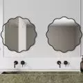
The wallpaper can also be found in the master bedroom. The interior is complemented by bedside tables and a ceramic lamp. Also worth noting is a round mirror and a suspended dressing table. Its fronts also refer to the furniture found in the living area.
Bedroom
Photo: FOLLOW THE FLOW
Are you decorating your apartment? We have more inspiration for you! Click HERE


