The pursuit of minimalism doesn't have to be boring. Ewa Tabakowska of the Grid studio created a project for clients from Krakow, who opted for minimalism, with white and wood as the dominant colors.
The dominant elements in the interior are tones of white and wood
Photo: Szymon Konik, Norbert Adamowicz, © Ewa Tabakowska
The apartment is located in Krakow's Prądnik Czerwony district. The ninety-square-meter apartment was inhabited by a couple for whom minimalism was the most optimal solution. They didn't want to fall into a mania for an excess of unnecessary accessories. The investors travel a lot, so first of all they also focused on a small display space for souvenirs - selected in a very precise way. Each item has its own specific place.
entering the space
The apartment has a long hallway that leads to a living room combined with a kitchenette. Its arrangement was one of the most important design challenges for the architect. She decided to finish the interior with plaster imitating concrete, giving the hall a post-industrial character. Black accessories and furnishings contrast with it.
In this minimalist development, unnecessary details and textures are limited
Photo by Szymon Konik, Norbert Adamowicz, © Ewa Tabakowska
living room and kitchenette
The most important element of the living room is quartz sinter, appearing in the form of a kitchen countertop and as a wall facing. This is a durable and resistant solution that can calmly cope with mechanical damage or chemicals. The choice of this type of quartz sinter was dictated primarily by the need to maintain the color tone.
Quartz sinters are an aesthetic and durable solution for interiors
Photo: Szymon Konik, Norbert Adamowicz, © Ewa Tabakowska
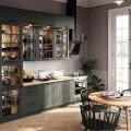
A small dining room was located next to the kitchenette, with a wooden table and gray chairs. Above it were three lamps of varying shapes and colors.
Certainly, geometric forms and the minimal amount of kitchen built-in materials used allowed to achieve the effect of a clean, but functional space," emphasizes architect Ewa Tabakowska of the Grid studio.
The annex is dominated by white
Photo: Szymon Konik, Norbert Adamowicz, © Ewa Tabakowska
bedroom
In the sleeping area, the most important thing was to maintain a consistent color scheme and design. The upholstered gray bed is the dominant point in this space. Next to it were small nightstands made of wood.
The bedroom correlates stylistically with the rest of the interior
Photo by Szymon Konik, Norbert Adamowicz, © Ewa Tabakowska
opting for minimalism
The designer and her investors decided to go for minimalism. Limit unnecessary and unnecessary expenses. Light and modest textures were varied only in key places. Such a choice of materials and colors is the best solution for people who find themselves badly in an excess of objects and accessories. Such an organization of the interior, allows customers, above all, to relax.
bedroom interior
Photo by Szymon Konik, Norbert Adamowicz, © Ewa Tabakowska


