In today's world we use lighting as more than, just a way to alleviate darkness. Light creates atmosphere, shapes sensations and gives a space functionality. It is these tasks that are becoming increasingly important. When creating a lighting design, the color temperature of the light plays a key role. It not only determines how the space looks, but also defines how the occupants of the interior feel. In this article, we'll take a closer look at light colors - explaining the difference between warm and cold tones, and where and when to use different temperatures in lighting design.
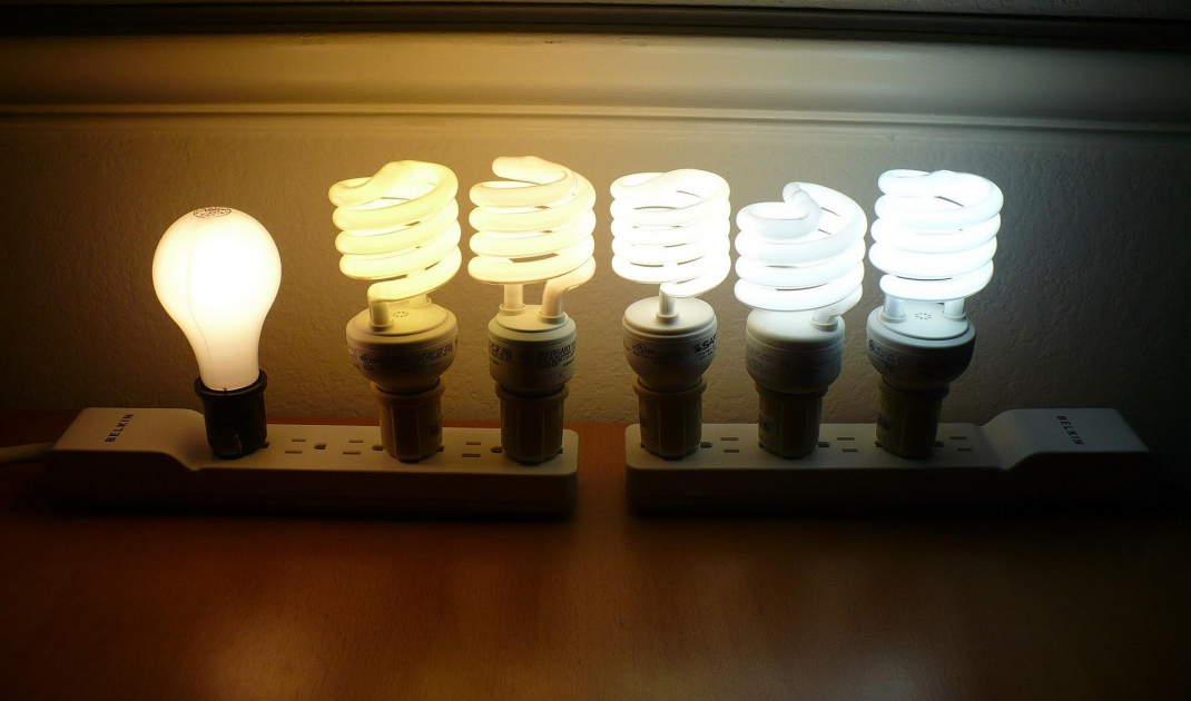
Light color of incandescent bulbs in degrees Kelvin
© Wikimedia.org
Color temperature of light
When we talk about the color temperature of light, we mean warm and cool. Warm light appears yellow, while cooler light has a white-blue color.
The color temperature of light is ranked in degrees Kelvin (K). The warmer the color, the lower the temperature. For example, candles burn at a color temperature of about 2000 degrees Kelvin, which is an orange-yellow color. 5600 K to 6500 K is daylight - then we talk about cold light.
The color display also plays a huge role in lighting. It measures how well we are able to see colors in a certain light. The value of the displayed color is measured by the CRI (from Color Rending Index), on a scale of 1 to 100 Ra. An ideal color display result would be 100 Ra (which is natural daylight), with 80 Ra typically seen in most environments. However, for places where lighting is extremely important-such as art galleries, museums and clothing stores-the standard is around 90 Ra.
Warm lighting promotes relaxation
© Jean Philippe
Warm light VS cold light - Where to use it
The color temperature of the light should be chosen according to where and why it is needed. This can be determined during the lighting design process.
Warm light of 2700 to 3000k is ideal for home interiors. The almost yellow glow helps create a welcoming effect of warmth and comfort. However, it is not the optimal lighting choice when you intend to focus and spend time productively. Warm light creates a high contrast, which means your eyes have to strain to adjust, which becomes tiring in the long run. That's why, for an office or other work environment, we recommend using cooler lighting between 3500 and 5500 K
Here's a breakdown of typical color temperatures for incandescent bulbs and their source:
1800k - Candle flame, sunset/sunrise
2400k - Standard incandescent lamps
2550k - Soft white incandescent lamps
2700k - Soft white compact fluorescent and LED lamps
3000k - Warm white compact fluorescent and LED lamps
3200k - Studio/photoflood lamps
5000k - Tubular fluorescent lamps or compact fluorescent lamps in cool white/daylight color
5500-6500k - daylight, overcast, electronic flash
6500-9500k - LCD or CRT screen
15,000-27,000k - cloudless sky on poles
Kitchen lit with warm vs. cold light
© Sidekix Media
How light temperature affects your interior
When choosing a color temperature for your space, consider the finishes and color palette used in the interior design. Reds, oranges and yellows look stunning when lit with warm white light (3000k). On the other hand, blues and grays can look clean and crisp under cool white light (4000k).
Kitchen and bathroom - here functionality is important. This can be achieved with plenty of cool light that mimics natural daylight. For this, kitchens and bathrooms are generally white, and with cool light you can create a clean and sterile arrangement.
Light temperatures should not be mixed in a room. Once you have decided on the look and style you want to create, and what is required for maximum practicality, stick to bulbs of the same color temperature.


