We have already looked at the arrangement of the master zone and one of the children's rooms of a house in Warsaw's Białołęka district. Today we present a bathroom by Line.Projekt Studio.
Coherent arrangement
The first floor of the 266-square-meter house was designed for the private zone. Thus, all the bedrooms and bathrooms are located here. The entire house is maintained in one color scheme. A harmonious combination of natural dark shades and light colors is mixed with the texture of stone. This is also seen in the bathroom.
Between the hygiene area and the built-ins there is a bath corner
© Line.Projekt Studio
Elongated forms
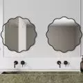
At the very beginning, the hygiene zone catches our attention. Two, large oblong mirrors have been illuminated with a soft golden light. White washbasins of the same shape were placed on a solid brown suspended cabinet. The furniture has a stone top, as well as both capacious, deep drawers and an open shelf. In addition, lamps on long cables were hung on both sides. Atmospheric light oozes from shades made of tinted glass.
Most of the equipment in the hygienic area has an elongated form
© Line.Projekt Studio
Delineated by color
The architects wanted to achieve a consistent effect. So they used large-format tiles measuring 120x120cm. The same monolithic effect is also present on the floor. Areas without tiles, have been paved with a smooth, durable and stylish micro-cement surface, in a color that matches the walls. However, architects used contrasting tile colors for this, delineating with them the different zones in the bathroom. The wall with the sinks, the corner with the bathtub and the built-ins are located in the part of the room that was covered with dark tiles. The toilet and shower, on the other hand, have been placed against a light background. This creates an interesting visual dichotomy that emphasizes the functionalities of the various fixtures.
The dark, minimalist shower contrasts with the light background
© Line.Projekt Studio
Are you decorating your apartment? Check out our bathroom design tips
Compiled by:KATARZYNA SZOSTAK


