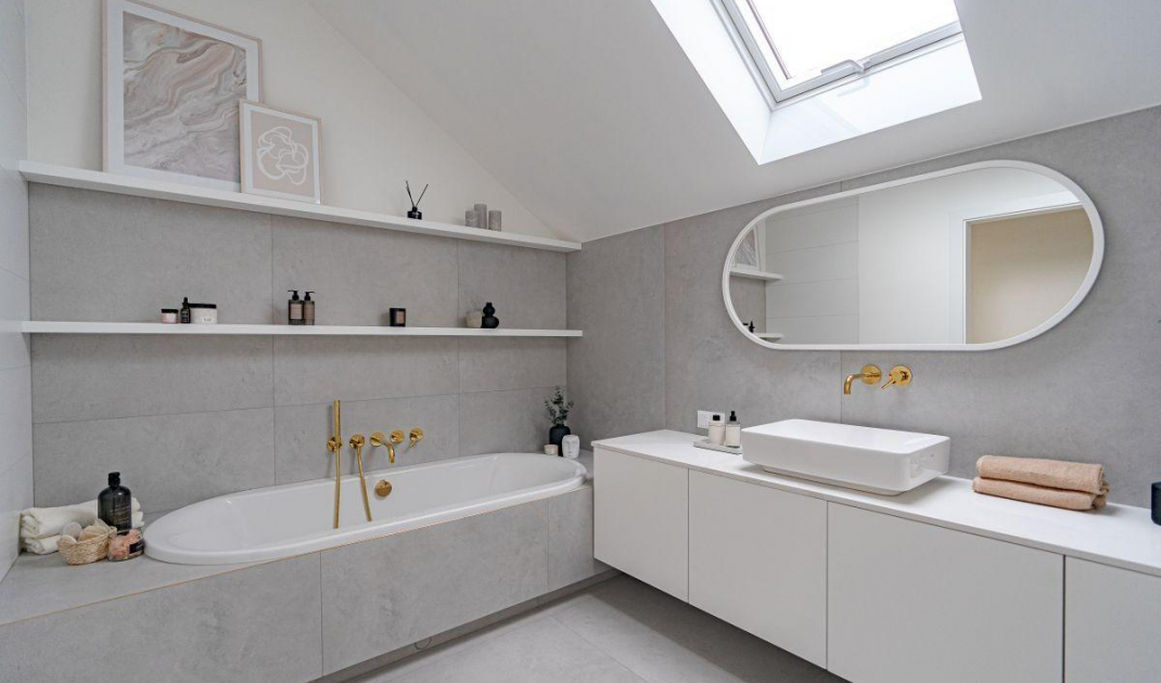
Paradoxically, the attic is a very graceful place to arrange a comfortable bathroom. An example is the interior of blogger Ola Marzeda-Czerwonka known as StylOly. In her bright bathroom there was space for a comfortable bathtub, a laundry room, as well as plenty of storage space.
The bathroom of interior design blogger Ola Marzeda-Czerwonka
© Geberit
Modern minimalism with a touch of glamour
Ola entrusted the task of designing her dream bathroom in the attic to architect Agata Kochoń of Blush Design studio. The project was to be universal, practical and aesthetically pleasing. The arrangement was created in cooperation with the Koło and Geberit brands. The dominant color is a light shade of gray. It is complemented by white. The walls and floor are covered with large tiles imitating cement. Meanwhile, white furniture and bathroom ceramics bring freshness and elegance to the interior. Such a color combination is ideal for modern arrangements.
The golden sink faucet introduces a touch of glamour
© Geberit
White, gray and gold
Despite relying on a cool color scheme, an unfriendly effect was avoided. Gold accessories add a cozy touch to the bathroom. Faucets in the sink and bathtub, furniture handles and the gold-colored door handle also introduce a touch of glamour. A quartz countertop under the sink with a marble effect adds charm to the room. The elegant and cozy atmosphere of the bathroom is emphasized by beautiful warm LED backlights. They were placed under the bathtub, two shelves, above the bathtub and around the mirror.
The bath area features a built-in bathtub
© Geberit
Round forms
Ola's bathroom is distinguished by modern, rounded forms. The most expressive element here is the mirror. The accessories and decorations such as a vase and a small mirror also have streamlined shapes. Similar curves are also repeated in the bathroom ceramics. In the bathing area there is a built-in bathtub. Around it, a lot of space was saved for decorations and bath accessories. The organic, rounded shape also has a hanging toilet bowl with hidden fixtures. It does not have any unnecessary folds and nooks. This makes it much easier to keep the bathroom clean.
Ola's bathroom is distinguished by its modern, rounded forms
© Geberit
Stylish breakthrough
What breaks out of the rule of keeping round forms is the countertop washbasin. The designer opted for a rectangular model. However, its interior is subtly rounded, which perfectly corresponds to the rest of the equipment. It is worth noting the spacious segment on which the washbasin is mounted. All the treasures of Ola and her family have their place here. Together with the tall closet, which hides the laundry room, the white, simple development allows to maintain the aesthetic appearance of the bathroom. At the same time, it creates plenty of storage space.
Around the sink there was space for storing trinkets
© Geberit
You can read more about bathrooms HERE


