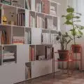
The interior designed by Ela Watras of the Projectoria Interior Architecture studio combines a traditional arrangement with an intriguing play on color. Subdued elements have become a great base for designer accessories and eye-catching kitchen furnishings.
Functional and atmospheric
The presented apartment has 30 m2 and is located in the Dwie Motławy investment in Gdańsk. This atmospheric and cozy interior was designed for short-term rentals. Bearing in mind the character of the interior, the architect suggested that good quality tiles with a delicate wood structure be laid on the floor. Designer Ela Watras stresses that despite the small budget, it was possible to realize a pleasant, cohesive and atmospheric interior.
Wall with clay plaster
Photo: Martyna Jablonska- Makowska / Martyna Soul Studio
Kitchen
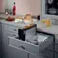
In the original functional layout, the kitchenette was located in the main area, here where the table and the built-in furniture now stand. The relocation of the kitchen was made possible by a very wide hallway, which made the interior more orderly, delineating the living and kitchen areas. The somewhat classic design is broken by a modern, simple annex building. Thanks to its rounded elements, it adds lightness and subtlety to the whole interior. Color is also important here. The blue kitchen enlivens the apartment and becomes its characteristic point. Opposite the annex a chest of drawers was hung, the fronts of which are made of vertical slats.
Kitchen
Photo: Martyna Jablonska- Makowska / Martyna Soul Studio
Living area
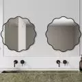
The investors wanted the main wall to be decorated with a custom-made rubbed structural plaster wall. The focal point of the room is a wide, comfortable bed with a textile headboard. Above it is an eye-catching mirror made to a custom design. Both these elements perfectly match the atmospheric character of the interior. In the living area, opposite the bed you will also find a chest of drawers on metal legs. Like the cabinet located in the kitchen, the piece of furniture has fronts made of vertical slats. Such a dialogue between the furnishings in both spaces makes the interior cohesive.
Living area
Photo: Martyna Jablonska- Makowska / Martyna Soul Studio
Are you decorating your apartment? We have more inspiration for you! Click HERE
Compiled by: KATARZYNA SZOSTAK


