From London to Warsaw's Praga district. Such was the path of inspiration that helped create this subtle and natural apartment. Antonina Sadurska and Katarzyna and Ewa Burak of the FUGA Architektura Wnętrz are responsible for this interior design.
The interior is inspired by the English style
Photography and styling: Aleksandra Dermont
Friendly cooperation
The spacious, more than 115-square-meter apartment in Warsaw's Praga district belongs to a couple with a young daughter. The apartment was shell and core, so the investors decided it would be better to enlist the help of a professional when decorating it. The owner recalled that her high school classmate Antonina Sadurska became an interior designer and together with Katarzyna Burak runs the FUGA studio.
-My colleague, and now also a client, is a classy woman who appreciates high quality and likes to surround herself with beauty. Together with Katarzyna, we knew that we could meet her high expectations, creating a comfortable place to live that would delight with functionality and aesthetics. We assumed that we would preserve and even emphasize the spaciousness of the interior, while making it enveloping and warm in expression - says Antonina.
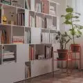
A dark green bookcase sets the tone for the office arrangement
Photography and styling: Aleksandra Dermont
Island inspiration
The owner of the apartment previously lived and studied in London. She also has family there. As a result, the English style is close to her, so she wanted to decorate her own apartment in it, interweaving the arrangement with elements of the classics and adding a little "delicate nonchalance". The architects prioritized the client's guidelines, but at the same time gave equal importance to issues related to functionality. Thus, the apartment was divided into three zones: living, children's and adult. The latter, which consists of a bedroom with a separate bathroom, a dressing room and a home office, is a real oasis of privacy and respite for the young parents. A separate corridor leads to the daughter's room and bathroom. The family living area is an open living room connected to the kitchen, which in summer is further expanded by the area of the terrace, full of greenery.
The architects took a long time to choose the ideal shade of the kitchen fronts
Photography and styling: Aleksandra Dermont
Soothing arrangement
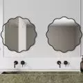
The color scheme of the entire interior was composed of light and neutral shades; these are primarily off white and beige, but also muted pink and natural wood tones. In the bathroom, gold fixtures shine discreetly, door handles and kitchen cabinet handles are also in the color of extinguished gold. A bright, subdued range, without colorful contrasts or expressive, strong patterns, makes the various rooms exude calm and security. The gentle, "soft" character of the arrangement is further emphasized by the careful selection of furniture. Their shapes are often rounded, and the lines are smooth. Attention is drawn to the mirror, with a frame in the shape of a stylized female figure. In turn, the lamp hanging over the dining table brings to mind, a woman's hat. Around the table stand classic Thonet chairs made of bent wood with plaid seats.
The rounded forms add to the coziness of the interior
Photography and styling: Aleksandra Dermont
Demanding beige
A classic and subdued color scheme, contrary to appearances, can cause quite a problem. The expression of calm, unforced elegance and expressiveness devoid of flamboyance, contrary to appearances, is not so easy to achieve at all. It is not enough to bet on pastels. In interiors filled with subtle colors, where nothing drowns out anything, harmony is based on the perfect matching of elements.
-Many people may think that an apartment bathed in beiges is a safe choice. We debunk these rumors. Beige is one of the most difficult colors. It has hundreds of warm and cool shades in its palette, and the choice can cause a lot of dilemmas, even for professionals - says Antonina Sadurska.
-Before we were able to find the perfect shade of beige for the fronts of the kitchen cabinets, the carpenter made many samples, which we subjected to advanced tests, watched in every possible light: natural, artificial, morning, evening. However, we don't regret a second spent on these debates, because the result is stunning - says Katarzyna.
The rattan closet was specially designed by the architects
Photography and styling: Aleksandra Dermont
Even more labor- and time-consuming was the selection of the base color of the walls. First, based on samples, the first shade was selected. Unfortunately, it did not work; the owners did not feel satisfied. So the entire apartment was repainted anew.
- The colors of nature are one of the biggest challenges in the work of an interior designer. In order for the effect to be stunning and natural, we really have to search and disguise for a long time, and moreover, repeatedly check how the selected tones look in a particular space, juxtaposed with materials, furniture and accessories - Antonina concludes.
The bedroom is an oasis of calm for parents
Photography and styling: Aleksandra Dermont
Polish craftsmanship
Wooden oak flooring is found not only in the rooms, but also in the lobby and kitchen. It was laid in a French herringbone pattern. In the parents' bathroom, the floor was made of terrazzo, while in the second bathroom tiles were laid, creating an attractive pattern. The kitchen and bathroom cabinets, closet and closet with rattan in the children's room were made by a carpenter friendly to FUGA, according to the architects' original design. Also custom-made were the window decorations, sewn by a seamstress cooperating with the studio. The vast majority of furnishings in the apartment come from Polish companies.
- We love and appreciate high-quality products from Polish manufacturers and works by domestic designers. If we can, we introduce Polish design into the interiors we design to the maximum extent - Antonina declares.
The bathrooms were also decorated in shades of beige
Photography and styling: Aleksandra Dermont
Are you decorating your apartment? We have more inspiration for you!
Compiled by:KATARZYNA SZOSTAK


