How to arrange an interior in the style of Wes Anderson? What exactly is this style? We present 5 things that are necessary when creating such an interior.
Bet on retro-style elements
© WestwingNow
Accidentally Wes Anderson is a phrase that has been regularly appearing on social media lately. Videos showing daily activities or vacation shots in the director's distinctive style have taken over the Internet. The account of the same name has as many as 1.8 million followers on Instagram. One of the characteristic elements of this filmmaker's aesthetics is, of course, interiors. Pastel, a little retro, eclectically combining many styles and colors. The director himself designed the interior of Bar Luce in the Fondazione Prada building in Milan. With the upcoming release of the American filmmaker's latest movie, titled "Asteroid City," the style is also making its way into our interiors.
Choose fabulous furniture and accessories
© WestwingNow
Symmetry and rhythmic repetition
Although the style may seem a bit chaotic, everything here is carefully thought out. Anderson's films are famous for their symmetrical frames, in which the actors are at the center and surrounded on both sides by repeating elements. Here you play the main role! When designing your interior, remember to place the same furniture symmetrically. For example, on both sides of the bed put identical bedside tables with identical lamps. Place the furniture itself perfectly in the middle. Surround the sofa in the living room with two armchairs from the same set. You will get the best effect by placing them directly opposite each other. You can easily achieve the effect of repetition with curtains, pillows and decorations.
Repeating elements will give the interior a rhythm
© WestwingNow
Daring and eccentricity
In the bar he designed, Wes Anderson relied on contrasting combinations of round shapes and acute angles. You, too, should not be afraid of unusual juxtapositions. Interiors in this style are eclectic, interweaving many different references, creating one surreal whole. Interesting combinations will help achieve that much-coveted bit of fairy tale character.
Create an eccentric arrangement
Photo: Kamila Palmowska
Pastel contrasts
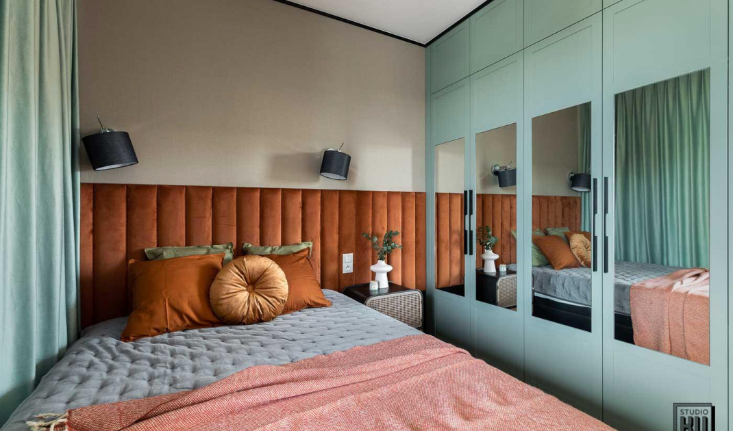
Pastels are the most characteristic element of Anderson's set design. However, you won't find rooms in different shades of blue or mint here. Pastel colors are contrasted, in the most unobvious way creating an absolutely unique arrangement. Pink is combined here with green, orange with blue and yellow with dim red. Put different colors together, play with them and look for combinations that suit you best. If you need help, take a peek at the color wheel and combine opposite colors together. However, remember to use their pastel version.
Put pastel colors together
© WestwingNow
Surrealism
Abandon patterns and established interior design rules. Wes Anderson's style takes us to spaces that look like a beautiful parallel world. Arranging in this aesthetic should take us away from everyday life. Opt for furniture and accessories with unusual shapes. You can also arrange a specific room inspired by a particular movie and arrange other room referring to another one. In this way you will create your mini Anderson world. Also get inspired by elements that appear in public interiors in the films of this director. A kitchen like a pastel bar or maybe a bedroom like from Grand Budapest Hotel? Here everything is allowed.
A substitute for a beach in the room will transport you to a surreal world
© WestwingNow
Individuality
Wes Anderson incorporates character-specific elements into the setting. Following this pattern, highlight in the interior objects that relate to your passions. On the dresser you can put a vinyl with an interesting cover and on the wall you can hang handmade paintings. The important thing is to make the interior uniquely yours.
Display private keepsakes
© WestwingNow
Are you decorating your apartment? We have more inspiration for you! ClickHERE
Compiled by:KATARZYNA SZOSTAK


