Last year, the Accidentally Wes Anderson trend gained huge popularity on social media. Today we present an example of an interior in such aesthetics - a project by Anna Baranowska and Joanna Felczuk of Butterfly Studio.
The apartment is inspired by the films of Wes Anderson
Photo: Mood Authors Styling: Eliza Mrozinska.
(Not) Accidentally Wes Anderson
The apartment is 80 sqm and is located in the heart of Krakow. The investors are a couple working in the creative industry. Privately, they are big fans of modern art and film style, in particular the aesthetics of Wes Anderson. As such, they decided that their home should be equally expressive. Full of pastel hues, geometric shapes and unobvious juxtapositions. Their dream was fulfilled by the architects of Butterfly Studio. Every detail was carefully considered and selected by them. From terrazzo tiles, to countertops, to pots. Nothing is random in this interior, not even the coffee mugs, grinders and jugs.
Architects Anna Baranowska and Joanna Felczuk took care of every last detail
Photo: Mood Authors Styling: Eliza Mrozinska.
Kitchen in shades of pink
The kitchen annex is distinguished by the use of delicate pink. This graceful shade can be found even in the joints between the white tiles. Thanks to this, the space gained a truly fairy-tale character. The kitchen was divided into two parts. The architects decided to abandon the classic island in favor of a table. The suspended ceiling, on the other hand, serves two functions. It hides the unexpected structural lowering of the building and houses the cassette with a drop-down screen for the projector.
The kitchen is dominated by a soft pink
Photo by Mood Authors Styling: Eliza Mrozinskaya
Vintage and Polish design
The arrangement features many interesting elements combining modernity with classics. The investor loves terrazzo. So she took care of the presence of this material in various forms throughout the apartment. It can be found from tiles, through countertops to flower pots. Thanks to the variety of patterns and colors, terrazzo blends beautifully with the pastel accents of the interior. The whole is complemented by carefully selected accessories. We can admire here, among others, totems by Koki Skowronska and vases from Ms. Jurek and Malwina Konopacka.
In the apartment we can find, among others, a vase from Malwina Konopacka
Photo by Mood Authors Styling by Eliza Mrozinska.
Geometric decorations
The main decoration of the bedroom is the original headboard. Interspersed solids in contrasting colors create an intriguing arrangement. The wall behind the bed is covered with vertical fluting in a blue shade, which adds depth and texture to the space. On either side of the bed are minimalist bedside tables, on which stand subtle decorations and a lamp with a modern, rounded shape. The whole is complemented by natural textiles in shades of green, beige and orange, creating a calm and cozy atmosphere in this unusual bedroom space.
The headboard of the bed has an interesting form of two interpenetrating blocks in contrasting colors
Photo: Mood Authors Styling: Eliza Mrozinska.
With a four-legged dog in mind
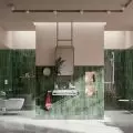
The arrangement of the bathroom is a combination of pastel shades of pink and blue. The wall above the countertop was covered with mint-colored tiles arranged in a herringbone pattern. They create an interesting contrast with the round gold mirror. Of course, the designers did not forget about the pet inhabiting the apartment. In the bathroom there was a special cabinet with a litter box and a small passage in the wall for the cat. This is a practical solution to keep things tidy. On the other hand, a washing machine and a dryer were placed in a built-in cabinet on the right side. Sophisticated details, such as the pink oblasted sink, patterned countertop and decorative lamp, make the whole an interesting and stylish composition.
A cat litter box was placed in the bathroom cabinet
Photo: Mood Authors Styling: Eliza Mrozinska.
Pastel colors and interesting textures
In the second bathroom, the use of pink tiles with a delicate sheen draws attention. They create not only an interesting decorative effect, but also optically enlarge the space. Patterned tiles with colorful flecks introduce another visually intriguing accent. The hanging cabinet of green shade, on the other hand, has been decorated with fluting and a gold handle.
The wall above the sink was covered with glossy tiles in a pink shade
Photo: Mood Authors Styling: Eliza Mrozinska.
Are you decorating your apartment? We have more inspiration for you!
Prepared by:KATARZYNA SZOSTAK


