


We have already presented a room for a teenage girl and a bathroom designed by Katarzyna Szostakowska of the Kate & Co. studio. Today we return to a Warsaw apartment, looking at the kitchen arrangement.

The arrangement of the apartment is very feminine
Photo: Yassen Hristov Styling: Magdalena Chudkiewicz
Out of love for unique objects
The apartment in Mokotow is inhabited by a mother and daughter. The arrangement is therefore extremely feminine. The interior combines Mediterranean and Parisian influences, and is complemented by natural materials and unique ceramics, which both residents love. The organic forms of vases and bowls by Ula Michalak and Ola Nadolny perfectly combine elegance and naturalness. The owner is also fond of antiques. As a result, a beautiful crystal chandelier hangs over the dining room table. The search for a suitable vintage lamp involved all three ladies. Mother and daughter and the architect combed antique stores and antique markets for a long time, until they finally found the right one in Bronisze.

The chandelier hanging over the table is an antique
Photo: Yassen Hristov Styling: Magdalena Chudkiewicz
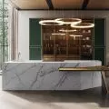
Beautifully non-ideal finishing materials
The kitchen area is marked by stoneware laid on the floor in a shade of light beige. In the rest of the living area, on the other hand, you will find rustic planks with visible knots. A deliberate design trick was to choose a collection in which the tiles seem not to stick to the dimension. As a result, the floor looks as if it was laid with ancient stone. However, the attention is drawn to the tiles with which the wall above the countertop was lined. Stoneware imitating heavily used marble in a pattern with shades of white, cream and burgundy creates a distinctive and elegant composition. This is complemented by the dark fronts of the kitchen cabinets - they resemble patinated sheet metal, although it is laminate.


The wall above the countertop is covered with tiles imitating marble
Photo: Yassen Hristov Styling: Magdalena Chudkiewicz
Bold color accent
- I must admit that the investor showed a lot of courage. She was not afraid of rustic wood with knots, and above all she accepted the bold color of the quartzite countertops," says Katarzyna Szostakowska.
At first there was even concern that in a bright interior the red stone would be glaring, but in the end the client trusted the architect. It paid off. In addition to its intriguing appearance, the natural quartzite offers great durability, which is absolutely crucial in the kitchen area. A noteworthy detail is the carefully selected connectors. Their sandy hue and rounded corners emphasize the feminine character of the arrangement. The soft lines and roundness of the fixtures blend beautifully with the entire interior, as the designer has consistently avoided sharp edges and contrasts.


The countertop was made of natural red quartzite
Photo: Yassen Hristov Styling: Magdalena Chudkiewicz
Are you decorating your apartment? We have more inspiration for you!
Design:KATARZYNA SZOSTAK