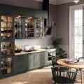
We have previously presented a hallway designed by Tatevik Caturova and Ewa Franiak of Flow Interiors studio. Today we take a look at the master bedroom of an apartment in Sopot.
The private part of the seaside apartment consists of a bedroom and an adjoining bathroom
Photo: Tom Kurek © Kontakt Simon
Cozy luxury
The apartment is located just 400 meters from the beach. The investors are a married couple who created their seaside oasis here. The owners wanted the interiors to be minimalistic but cozy. So architects Tatevik Caturova and Ewa Franiak created a timeless space, combining classic elegance with a homey feel. The combinations of various materials, fabrics and textures come to the fore.
- We opted for high-quality materials - natural stone, quartz sinters, wood. There is no shortage of premium materials, decorated with sublime accessories in the form of lamps, sconces and even contacts, the designers say.
The designers used the same colors in the bedroom as in the other rooms
Photo: Tom Kurek © Kontakt Simon
Glow and warmth
The arrangement of the bedroom is a consistent continuation of the design. Here we can find the colors already known from the hallway - sage and gray. The whole is complemented by shiny accessories, including carefully selected light fixtures and electrical fittings. A cozy character is introduced by upholstered panels placed on the wall behind the bed. Their vertical stitching adds dynamism to the arrangement and perfectly matches the finish of the bedside tables and bed frame.
The wall behind the bed was covered with upholstered panels
Photo: Tom Kurek © Kontakt Simon
Interior polished to the last button
The designers took care of every detail. One such interesting element is the glass door, which separates the bedroom from the bathroom area. They use a special metal fabric that gives an amazing effect. When the wings of the door are slid down, it creates an illusory pattern.
- When creating this interior, we focused on the details," say architects from Flow Interiors studio.
The bedroom is separated from the bathroom by a glass door
Photo: Tom Kurek © Kontakt Simon
A feminine bathroom
The bathroom was to be subtle. So the architects decided to cover the walls with tiles with a marble pattern. Their delicate sheen harmonizes perfectly with the hexagonal tiles on the floor, creating a consistent, harmonious aesthetic. A freestanding bathtub with an interesting shape, on the other hand, adds character. An unusual wire lamp is mounted just above it. The circular wall lamp creates a sunbeam effect, casting soft shadows and emphasizing the texture and atmosphere of the interior.
A freestanding bathtub with an interesting shape adds character to the interior
Photo: Tom Kurek © Kontakt Simon
Unique details
Despite the small space, the designers managed to fit two washbasins. As a result, each spouse is free for morning grooming. Dark wooden furniture creates an interesting contrast with the rest of the room. They also offer plenty of storage space, while maintaining the minimalist character of the arrangement.
The designers managed to fit two washbasins
Photo: Tom Kurek © Kontakt Simon
Are you decorating your apartment? We have more inspiration for you!
Design:KATARZYNA SZOSTAK


