Does adding an unexpected touch of red improve the look of any interior? We test a viral theory from TikTok!
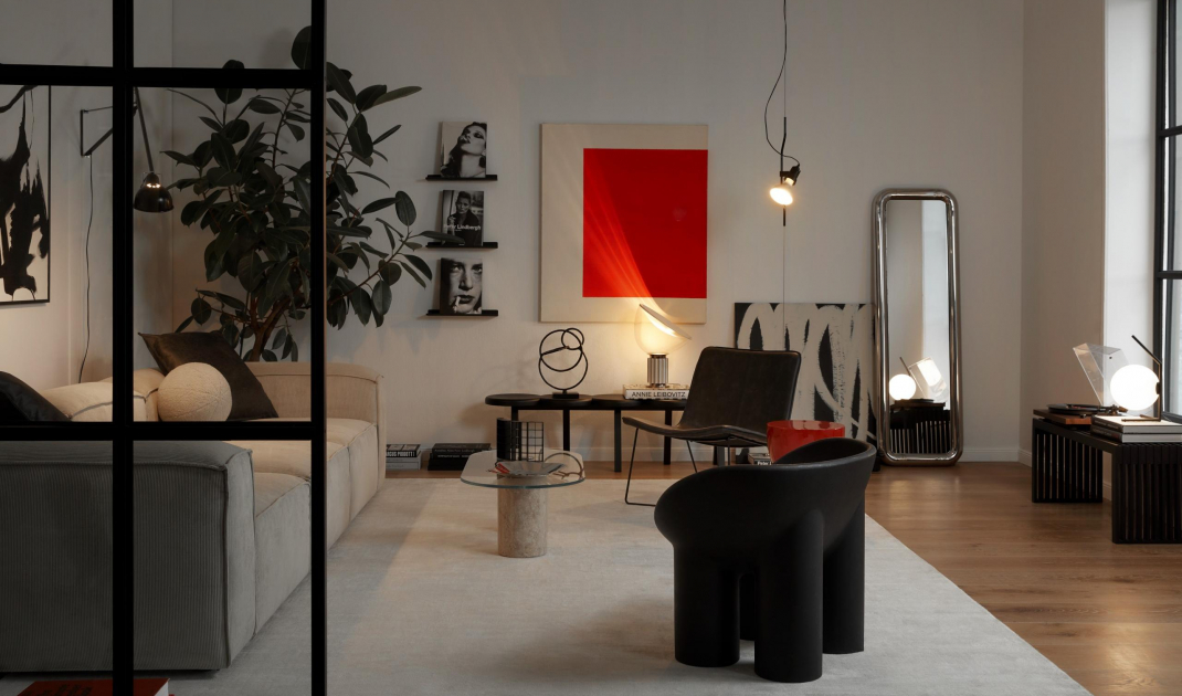
According to this theory, red accents make an arrangement visually more interesting
Photo: Almond Studio
Let yourself be surprised
Unexpected Red Theory is the concept of adding unexpected accents of red to an arrangement. The trend was started by American architect Taylor Simons. The designer claims that such a strong, colorful element creates an interesting focal point and improves the look of any interior. Is this true? Let's check!
The importance of red
The choice of colors is a key issue when decorating an interior. So before choosing a particular color, it is worth finding out what its significance is and how it affects the audience. Red is a strong, energetic color and is often associated with passion, love, but also aggression and danger.
- It is a color full of energy and passion. Introducing red into an interior, can increase the level of excitement and activity. However, too intense red can also lead to feelings of stress and aggression, explains architect Piotr Redlisz-Redlicki.
A red table can transform the entire arrangement
© WestwingNow
So we have to be very careful when using red in the arrangement of our house or apartment. This is where Unexpected Red Theory comes to the rescue. This is because this trend consists of using only one strong element. It can be a small decoration or a larger piece of furniture. However, the key is to use a single accent in a shade of red. So we can try this trend even in minimalist, beige rooms. How about a fiery addition to make it more visually appealing?
Red armchair will add character to the interior
© WestwingNow
Key elements of Unexpected Red Theory
Undoubtedly, using red in unexpected places can introduce an element of surprise and enliven a space. However, how to do it right?
Accents
In this case, less is more. Use red in small but distinctive accents, such as pillows, paintings, rugs or lamps.
A red painting will enliven a dark bathroom
Photo by Martyna Rudnicka Styling by Anna Salak
Contrast
The strength of this trend lies in contrast. Juxtapose red elements with a more subdued background. Shades of white, beige and gray will work well, as well as black and gold. If you prefer bolder combinations bet on olive green or blue.
The red element should be balanced with softer colors
© WestwingNow
Go off the charts
After all, red is meant to be unexpected. So use colorful elements in non-obvious places. For example, it could be the inside of a cabinet, the underside of a shelf or a small section of a wall. In a white kitchen, maybe paint the fronts of one cabinet red. In a bright bathroom, add subtle red accents in the form of towels, a soap dish or small decorations.
Red stools in a white kitchen will create an interesting contrast
Photo: Almond Studio
Are you decorating your apartment? We have more inspiration for you!
Compiled by:KATARZYNA SZOSTAK


