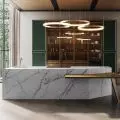
The project combines classic style, modernism and Polish design. Its author is Sandra Białkowska of the Dobry Układ studio.
Controlled glamour
The interior was to be elegant, timeless and include a warm color accent. The aftermarket house underwent a major makeover. Although the existing kitchen was retained, everything else - the living area with living room and dining room, lobby, bedrooms and bathrooms - was redesigned. Listening to the investors' expectations, designer Sandra Białkowska focused on the modern classic style, which determined the character of all the rooms. The chosen colors, materials, textures and forms create a harmonious whole, in which every element is in its place. Classic and modern accents appear side by side in perfect balance.
Dining room with a striking chandelier
© Dobry Układ
Unobvious combinations
The classic vibe clearly dominates already in the lobby. Rich stucco walls and ceilings, as well as alluding fretwork decorating the wings of the interior doors. Elegant gold wall sconces, meanwhile, have been juxtaposed with modern rail fixtures. All this together creates a unique effect.
In the lobby, classic elements are combined with modern fixtures
© Dobry Układ
Unique fixtures
It's worth noting the carefully considered and refined setting in the form of materials and decorations. The wall on which the TV is located has been decorated with stucco, gold leaf, a motif of vertical fins and glass. All these create an intricate composition.
The wall with the TV
© Dobry Układ
A mix of styles
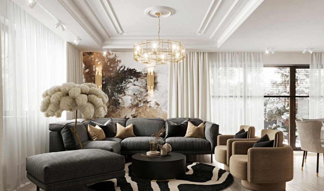
The representative character of the living room is reflected in the set of lounge furniture. Unobvious, eclectic, but definitely impressive. The elegant corner sofa and pouffe from the same collection were juxtaposed by the designer with armchairs. Although the two pieces of furniture differ in form, style and color, at the same time they perfectly harmonize and balance each other. Soft and chic graphite sofa on legs fits perfectly into the modern classic style. In turn, geometric armchairs in their sculptural shapes are the quintessence of modernism. As the designer explains, their minimalist form breaks the ubiquitous glitz. The armchairs are intriguing due to their interesting, changing shape. The seat with armrests of optimal height is supported by a rotating base. Thanks to this, the form, which provides pleasant relaxation, can be easily adjusted to the possibilities offered by our space.
Armchairs and coffee table
© Dobry Układ
The art of balance
A black coffee table with a simple but distinctive form acts as a stylistic connector. The whole set, bold and sophisticated at the same time, attracts attention. It is a great example of the fact that good design is not only timeless, but also perfectly co-creates interior designs in different conventions. Subdued shades of furniture create a great background for decorations and accessories in the color of old gold. A striking accent is the wallpaper on the wall behind the sofa, whose graphic pattern effectively combines all the shades present in the arrangement.
On the wall behind the sofa is an ornate wallpaper
© Dobry Układ
Are you decorating your apartment? We have more inspiration for you! ClickHERE
