The owner of the two floor apartment in Warsaw was keen to combine functionality with harmonious, timeless styling. Agnieszka Świderek of the Deer Design studio therefore based the visual side of the project on a rich range of white and wood tones with accents of black.
The living area is located on the first floor
Photo: Zagórny Studio
No divisions
Those entering the apartment are greeted by a hallway open to the living room. Here there is a discreet passage to the utility room, an important element of the functional side of the house. The capacious storage room will accommodate all necessary clothes. The furniture, designed by Dorota Majkut, was made by sister company Deer Wood Pracownia Stolarska.
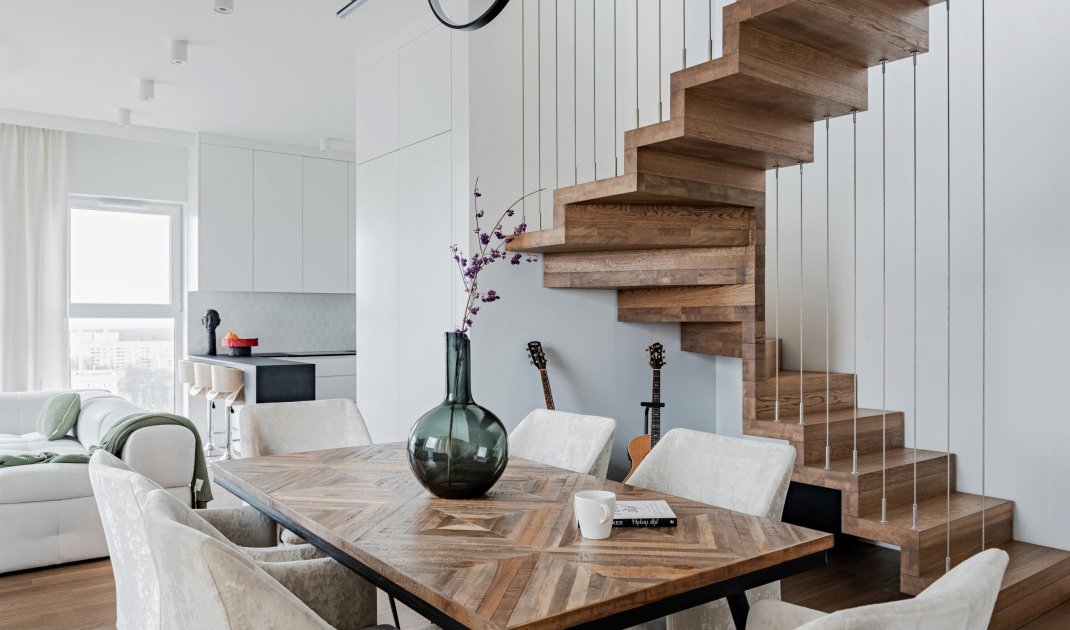
- The living room consists of three smoothly connecting zones. Through the dining area we get to the lounge area with a comfortable sofa, and further to the kitchenette. The kitchen has a semi-open character. It is invisible from the front door, but through an extensive peninsula with hockers and appropriately composed cabinetry it connects to the rest of the living space. It also repeats the materials and colors familiar from the dining room and lounge area, which ultimately blurs unnecessary divisions — says Agnieszka Świderek, an architect at Deer Design.
Semi-open kitchenette
Photo: Zagórny Studio
Cleverly hidden
For the sake of the impeccable appearance of the living space, the architect proposed a particularly careful setting for the temperature regulating devices. First, she decided to replace the developer's fluted radiators with decorative models. The air conditioner, on the other hand, was integrated into the built-in. As a result, in other seasons the device can be easily covered with a magnet-mounted furniture front. A keen eye will also notice that elegant touch switches have been used throughout the apartment.
Rest area
Photo: Zagórny Studio
Impressive bathroom
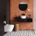
The guest bathroom was intended to be a representative room, so the materials used here refer to those of the living area. Attention is drawn to the large mirror with LED backlighting, which emphasizes the three-dimensionality of the tiles. Similar effects can also be found in other parts of the apartment. Mosaics, tiles and large-format plates, play wonderfully with thoughtfully composed lighting and present a great variety of textures, accentuated by light. In the bathroom itself, one can't help but notice the newly elegant ceramics and jewel-toned gold faucets.
The guest bathroom has a representative function
Photo: Zagórny Studio
Around the staircase
The two levels of the apartment were connected by a staircase with a carefully designed form. Both the investor and the architect wanted them not only not to overwhelm the interior, but rather to become a "functional sculpture" — an element of equal utility and decoration. That's why the same plank that appears on all the floors except the bathrooms appeared in their elegant design. Wood plays a very important role in the interior design.
Decorative staircase
Photo: Zagórny Studio
Also not coincidental are the unusual „balustrades” in the form of steel ties stretched between the ceilings. It is easy to see in them the inspiration of the guitar that the owner of the house plays. Two instruments belonging to him are, by the way, displayed here. Robert Mączka coordinated the finishing and construction work on this project.
Guitar-inspired staircase
Photo: Zagórny Studio
Are you decorating your apartment? We have more inspiration for you! ClickHERE
